KYC Review Manager
Senior Product Designer
2022
Background
What is KYC?
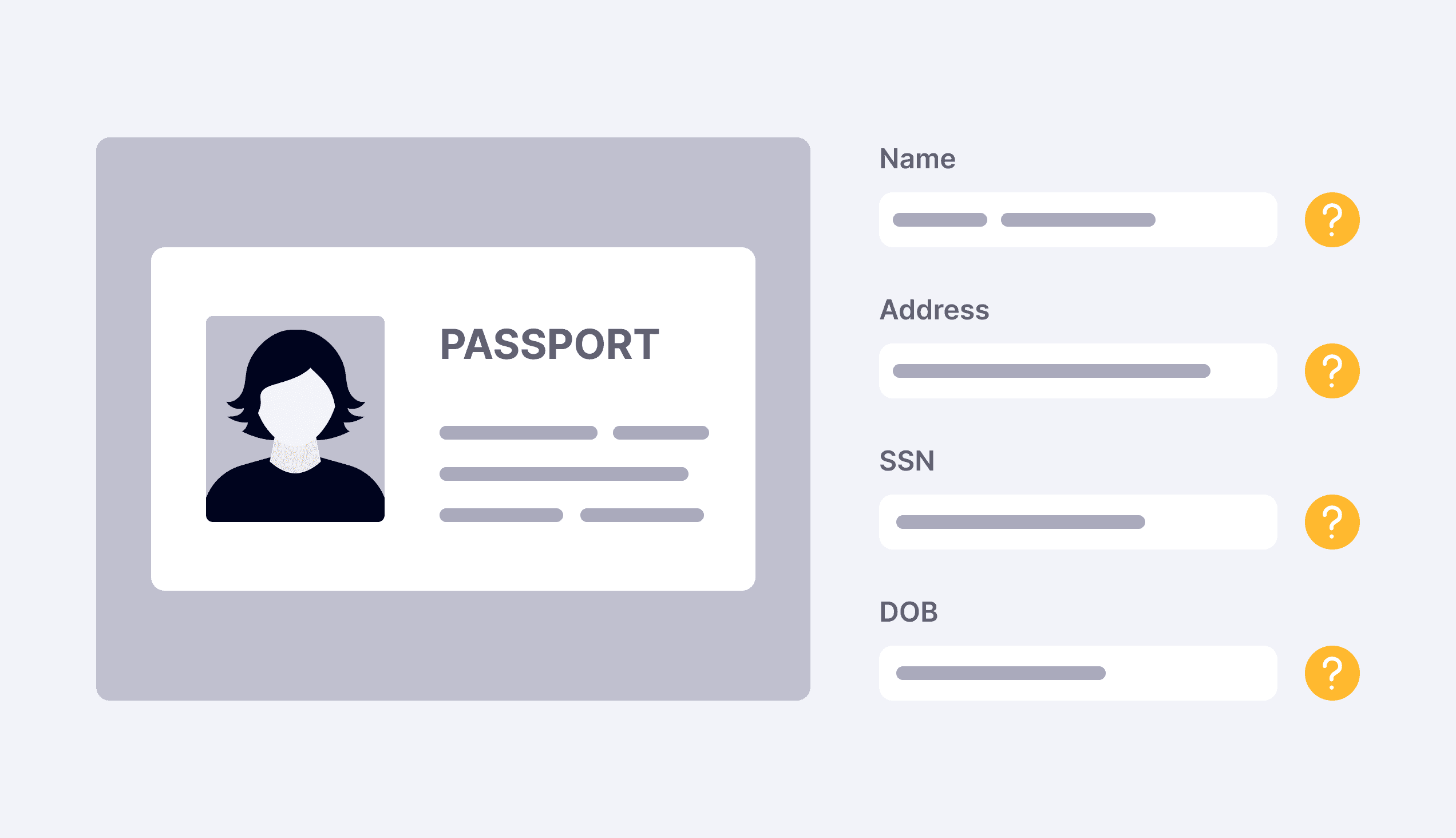
KYC is the mandatory process of verifying an applicant's identity before issuing a payment card to them. While most applications are approved or declined automatically within seconds, 10-20% of declined applications require manual review, where risk operations teams evaluate government-issued IDs and other supporting documents to determine whether an application should be approved.
At the time, manual reviews were handled by either Marqeta's internal risk team or risk teams of its customers, depending on contractual agreements. However, reviewers lacked suitable tools to efficiently evaluate documents, resulting in a manual, clunky experience.
As the sole designer on this project, I led the end-to-end design process from discovery through launch, partnering closely with one PM and a team of engineers.
Problem
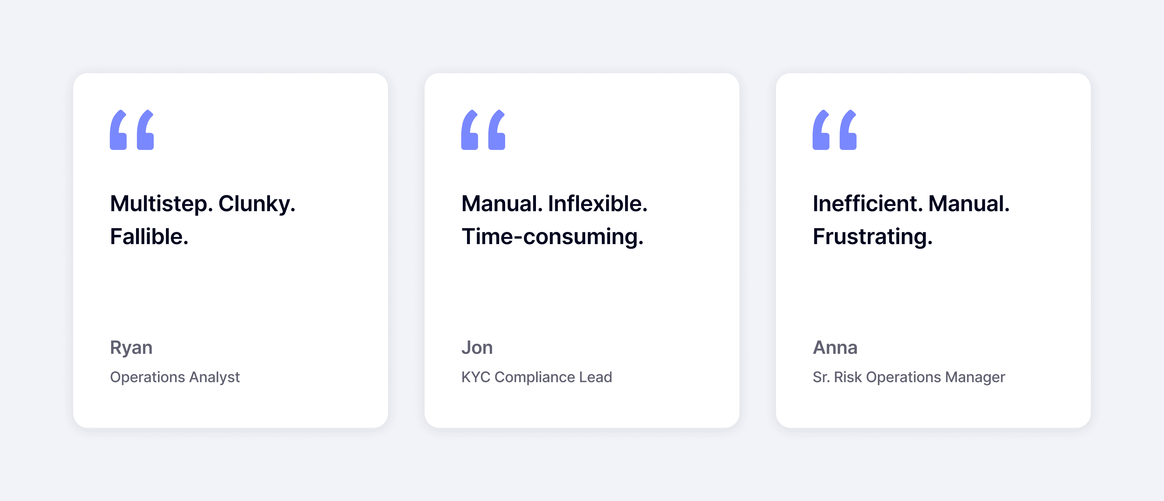
Manual reviews were time-consuming, prone to errors, and led to a frustrating experience
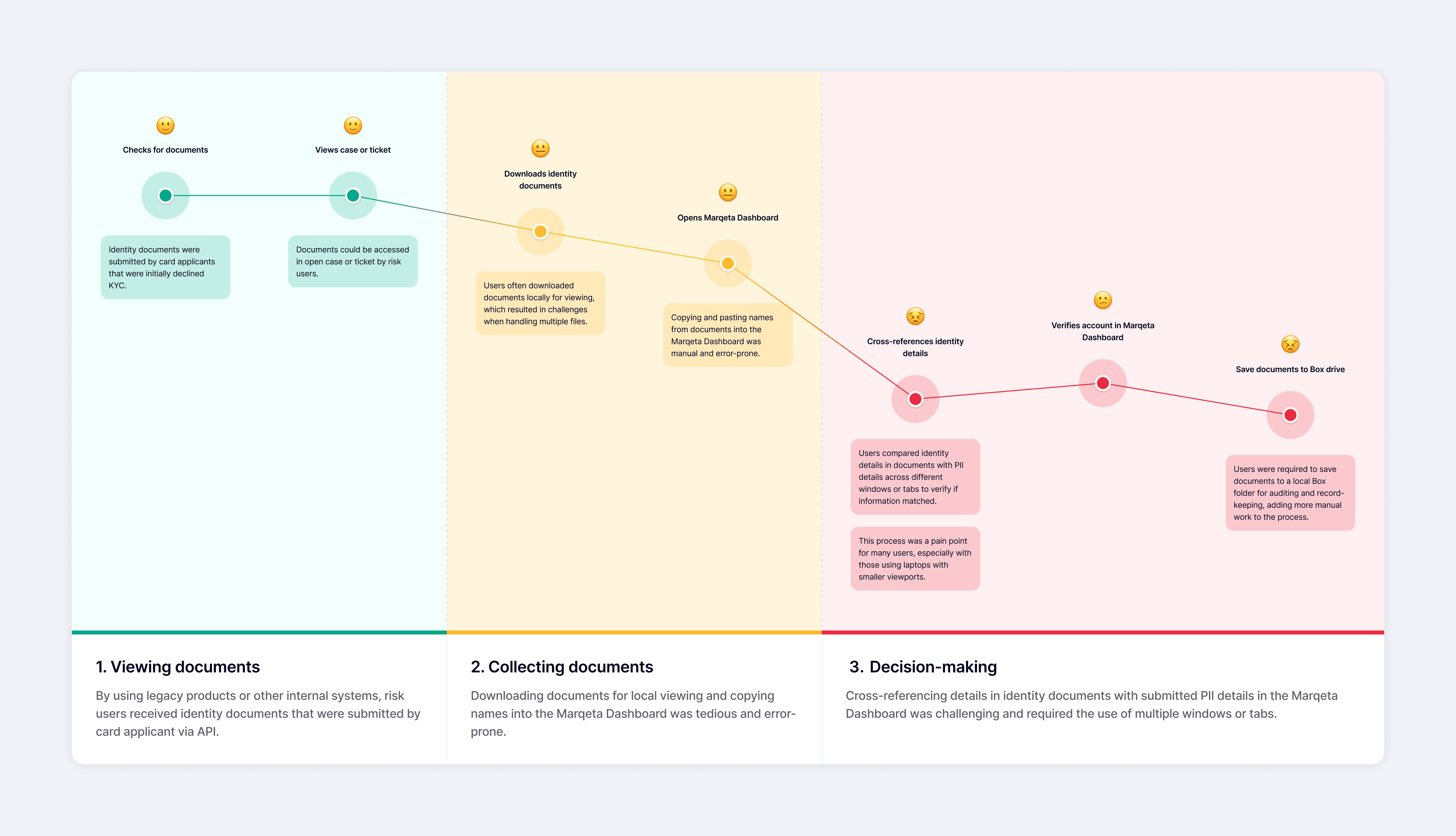
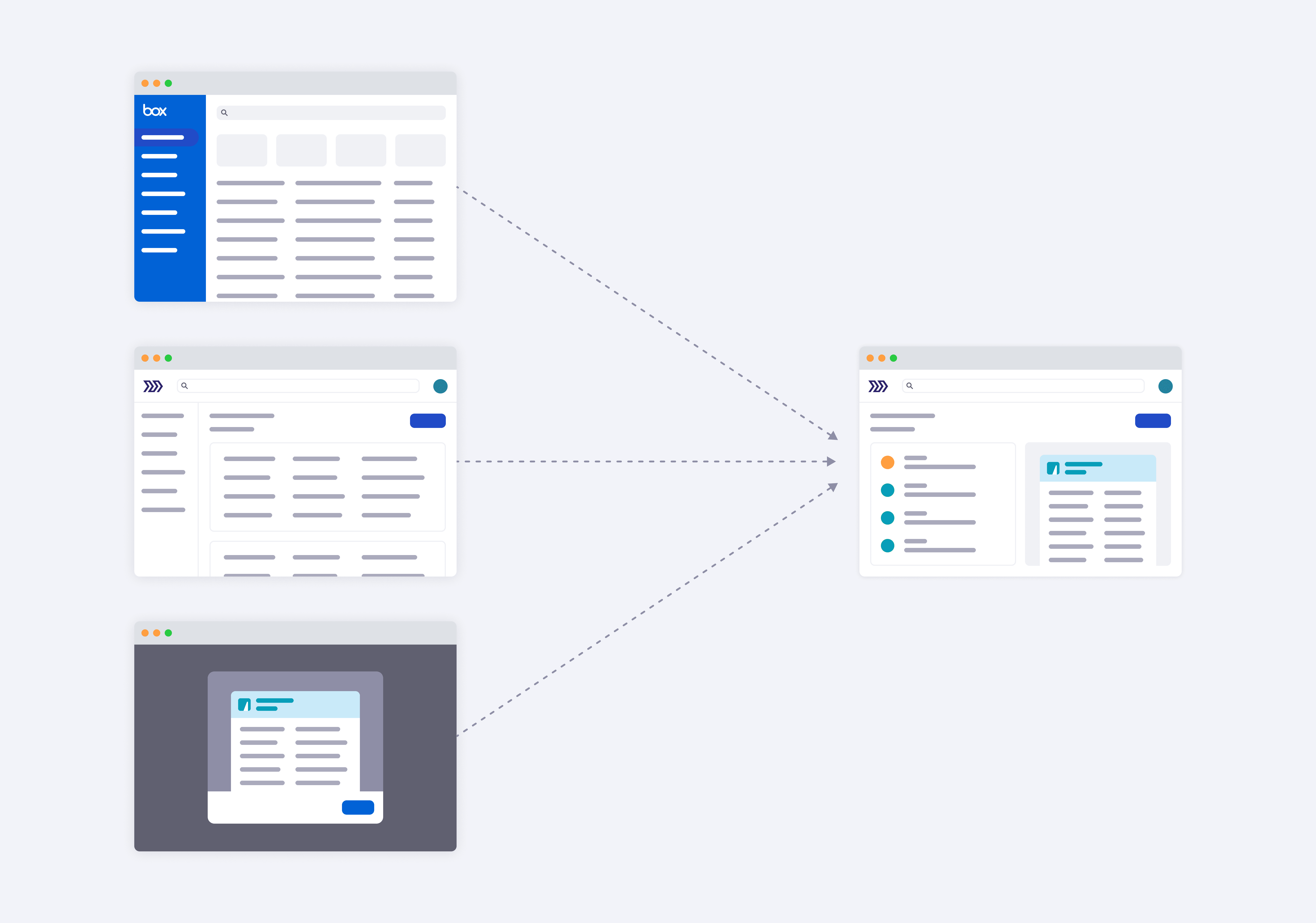
Users performing manual KYC reviews had to navigate multiple systems and follow a complex, multi-step workflow to complete a single review. They relied on a combination of legacy tools, the Marqeta Dashboard, and Box to retrieve identity documents, reinstate accounts, and maintain records.
During interviews, users revealed that this workflow wasn't just inefficient, but it was also error-prone and often delayed account approvals by several weeks, which ultimately created a poor experience for both reviewers and card applicants.
Hypothesis
Creating a unified interface
We believed that consolidating all information and actions into a single case management tool within the Marqeta Dashboard would streamline the manual KYC process, increase efficiency, and improve the overall UX.
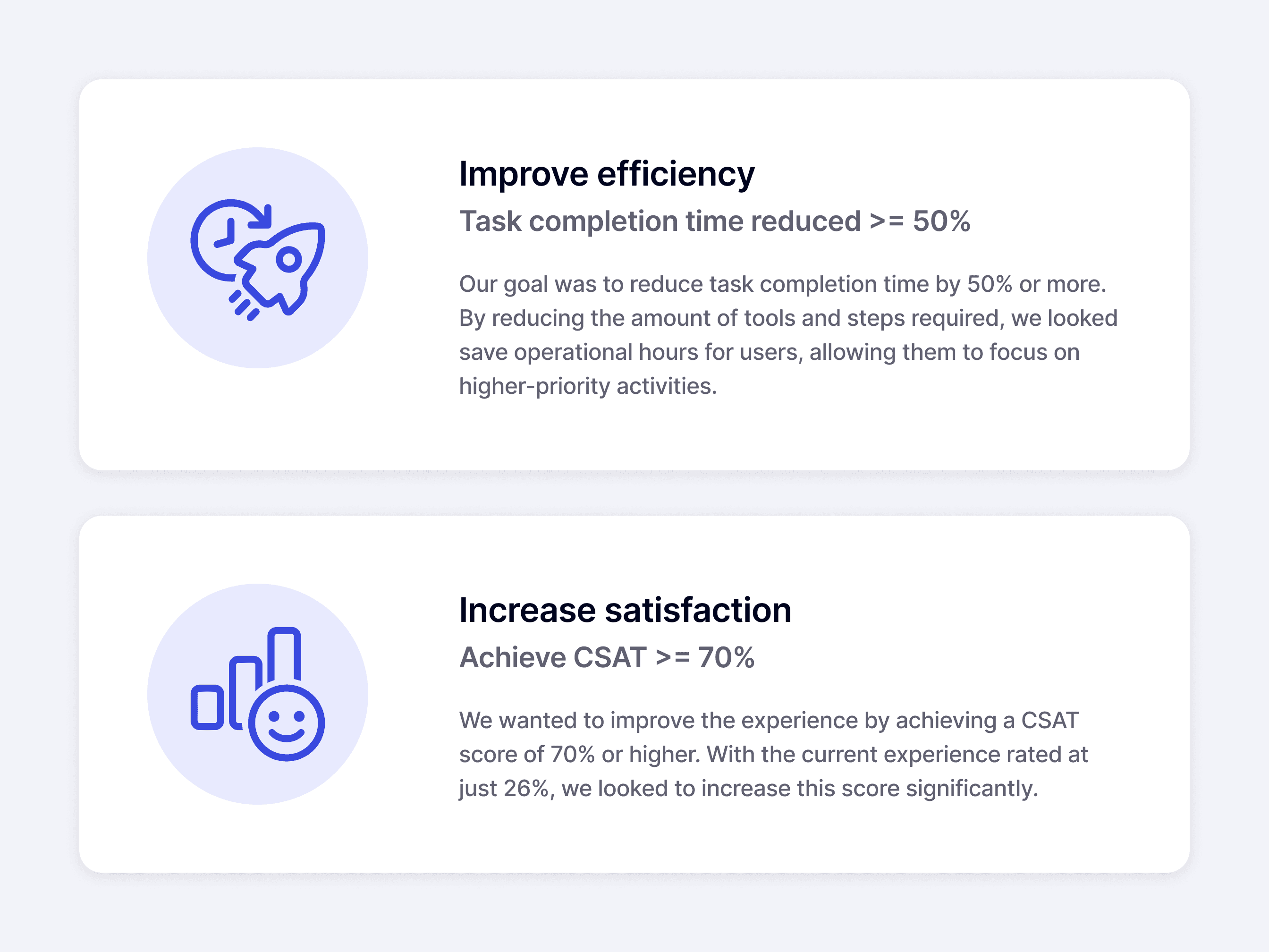
I partnered with my PM to define the project's goals and success metrics. While improving workflow efficiency was our primary objective, we also wanted to create a more satisfying experience for users throughout the review process.
Approach
Gathering feedback from different perspectives and refining
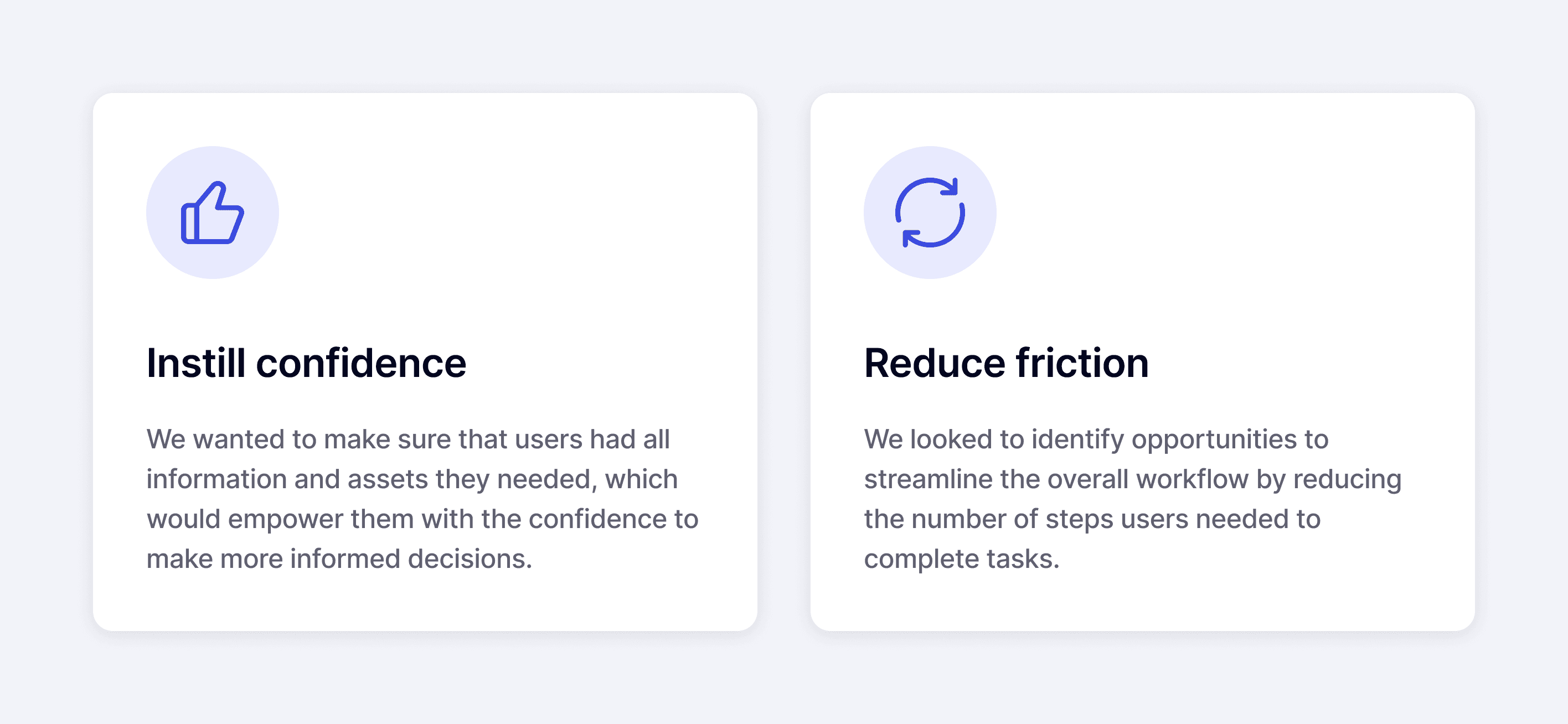
Based on our early findings, I established a few principles that guided us through the process as we progressed through different stages of the work:
Since this was a 0 to 1 product, our strategy focused on delivering an MVP with plans to refine the experience based on customer feedback after launch.
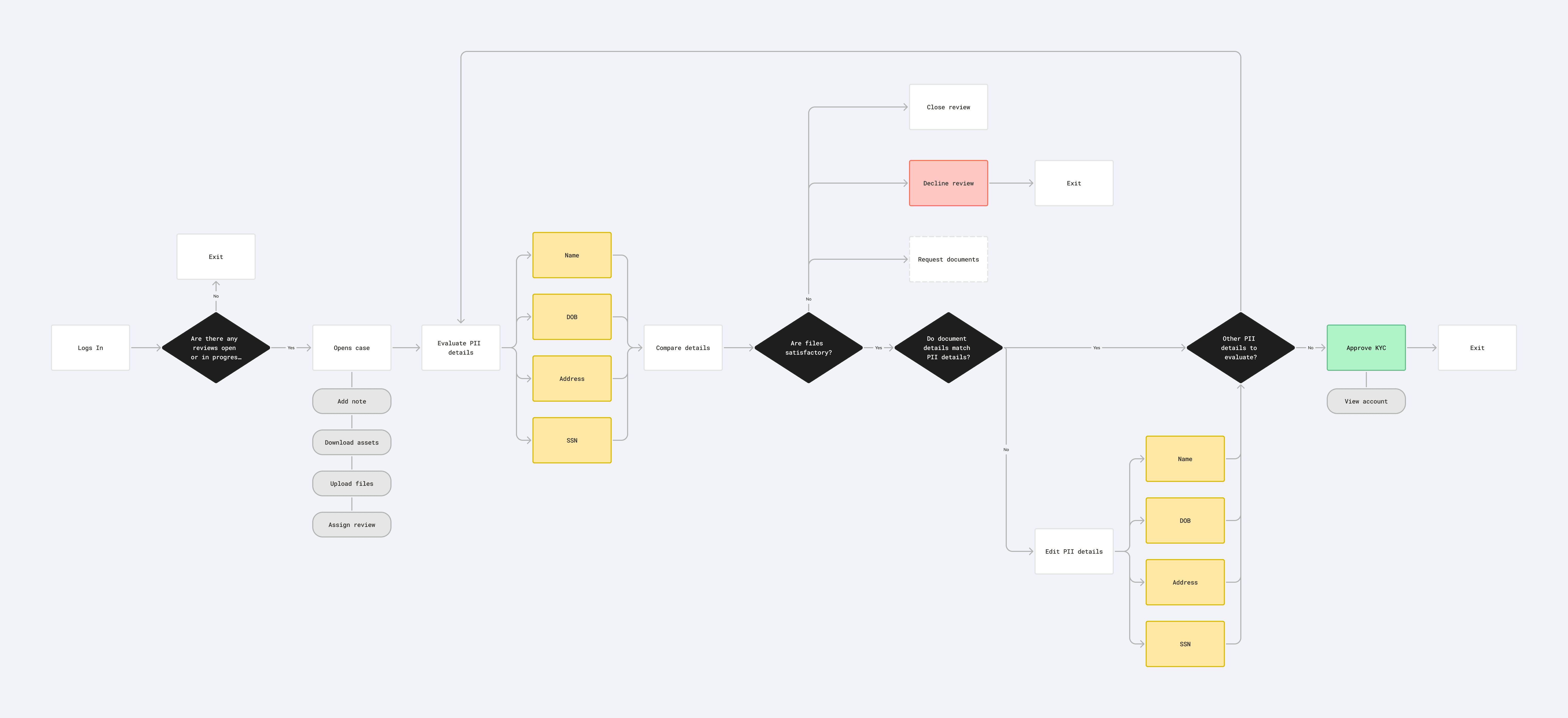
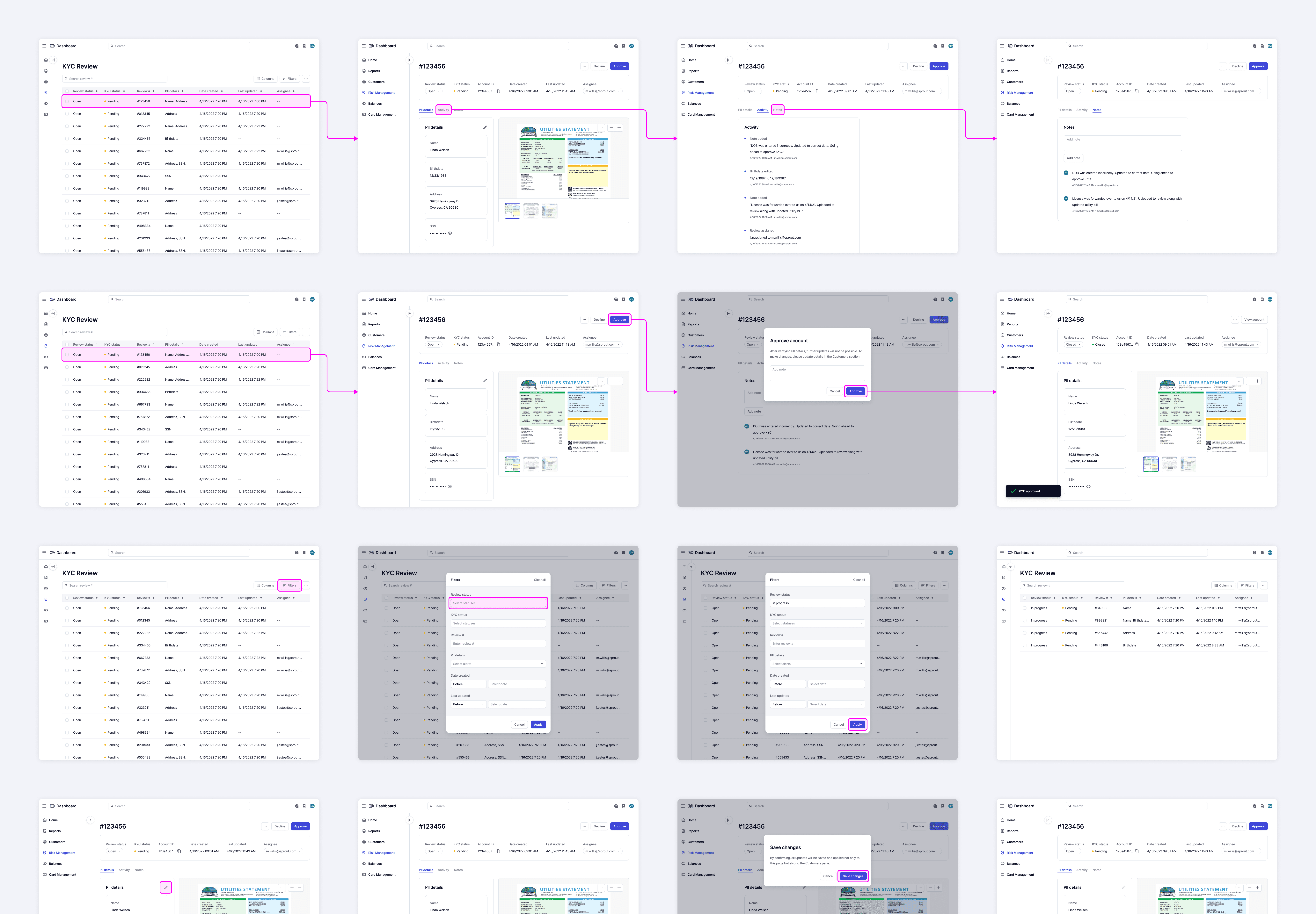
I mapped out the end-to-end workflow to define the structure of the new review system, clarifying the screens, actions, and system states required at each step. These flows also served as a shared blueprint for the team and helped backend engineers design the supporting APIs in parallel with the UI.
I regularly presented this type of work in design crits, biweekly squad meetings, and 1:1s with key stakeholders.
Explorations
Narrowing in on different options
My primary goal for the review details page was to consolidate all relevant information and actions into a single workspace, which would allow users to complete reviews without switching between screens. I narrowed in on two concepts that each had their own advantages and trade-offs.
During feedback sessions, users consistently preferred Option B because it made it easier to compare identity documents against application data side by side. Although Option A better leveraged our existing design system components, displaying documents in a modal obscured critical information on the page and made it difficult to cross-reference.
Based on this feedback, we moved forward with Option B. Although it required additional engineering investment to create a page-level variant of the existing image viewer component, I discovered that several other product teams had similar use cases. As a result, we designed and built a new component that could be reused across multiple products rather than solving only this project's needs.

Usability Testing
Testing to identify insights
Over the course of three weeks, we conducted moderated testing with 10 participants, which included 4 internal users and 6 external users. While we acknowledged that the designs weren't perfect, our priority was to get them in front of users to better understand what was working vs. what wasn't.
While most users were able to complete their core tasks, many usability issues revealed themselves as the design felt slightly short of our metric goals. We priortized these issues and addressed them as follow-up items.
Final Designs
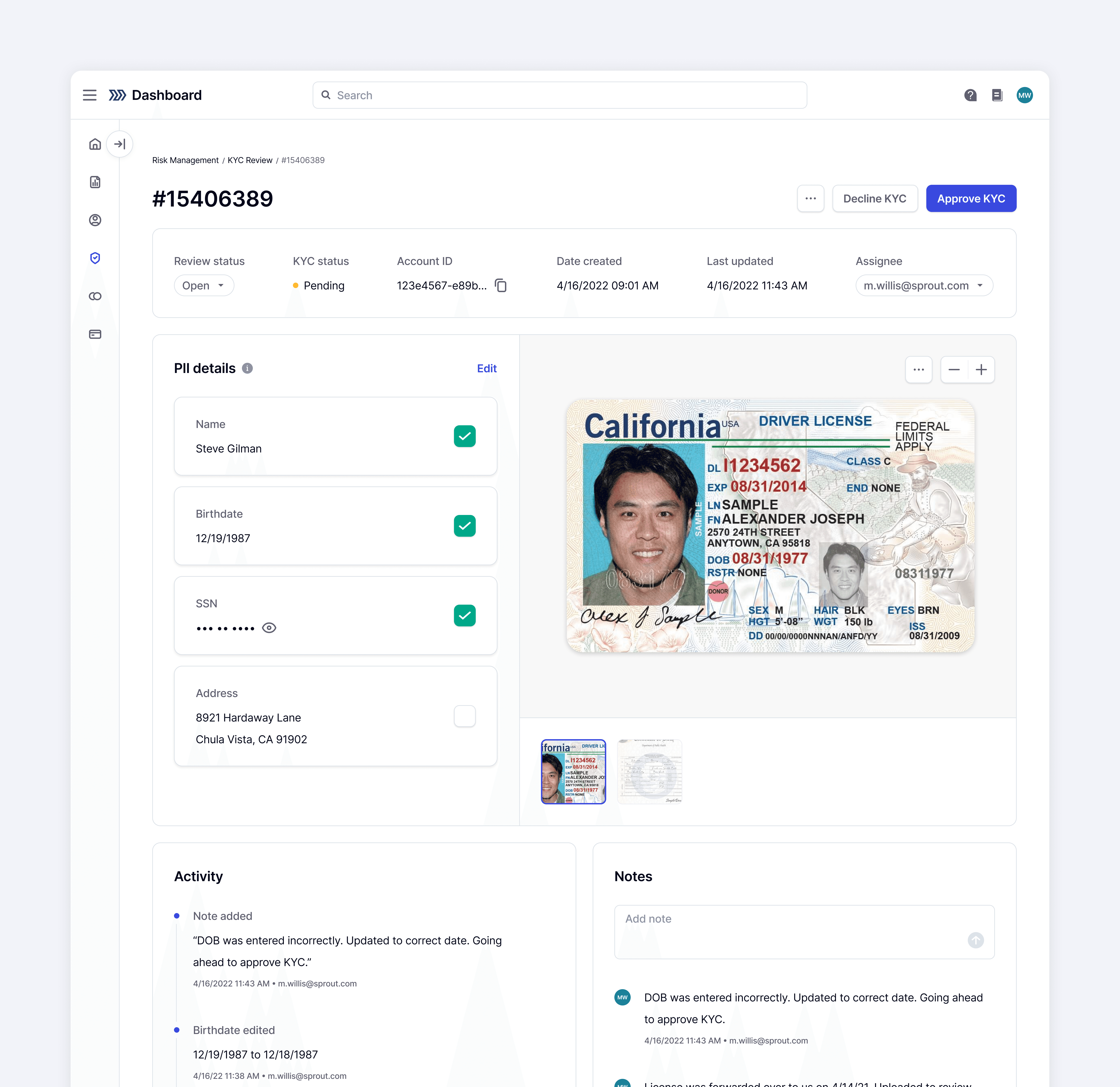
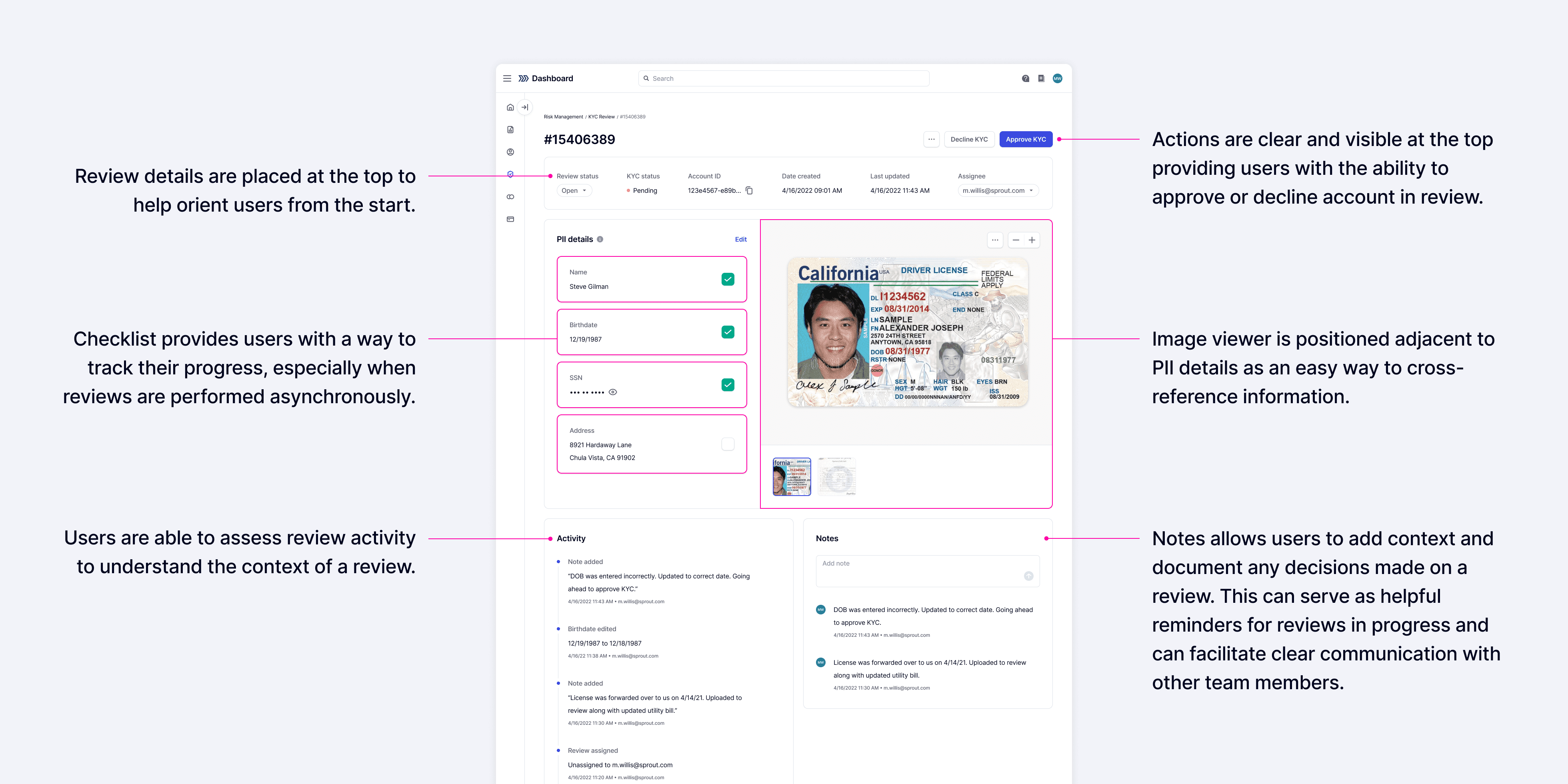
Providing a centralized tool for accessing all KYC assets, information, and actions
After addressing the issues identified during testing, we conducted follow-up sessions and received significantly more positive feedback.
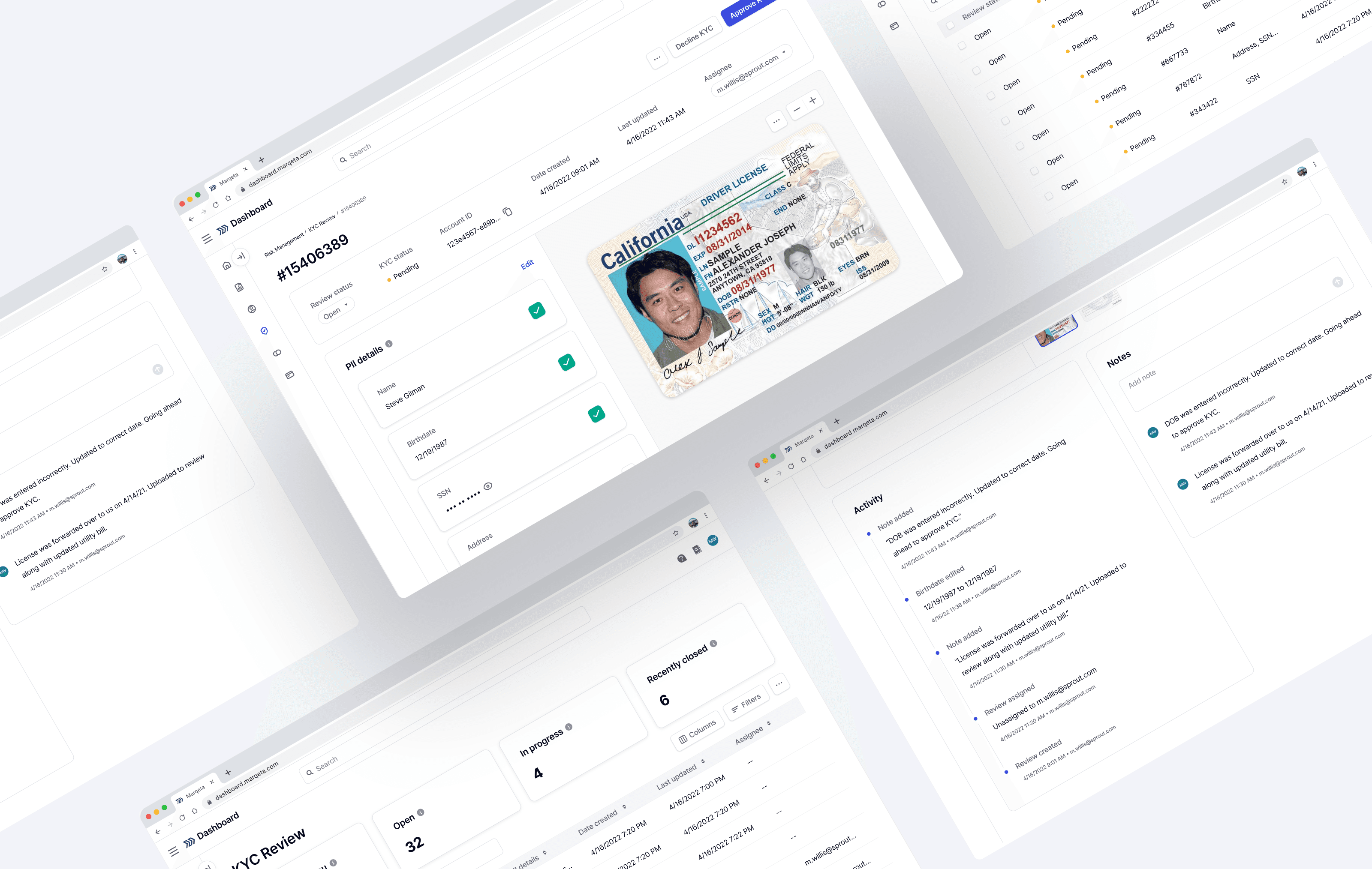
The final design brought all relevant information and actions into a single workspace, which reduced context switching and enabled users to complete reviews more efficiently.
Impact
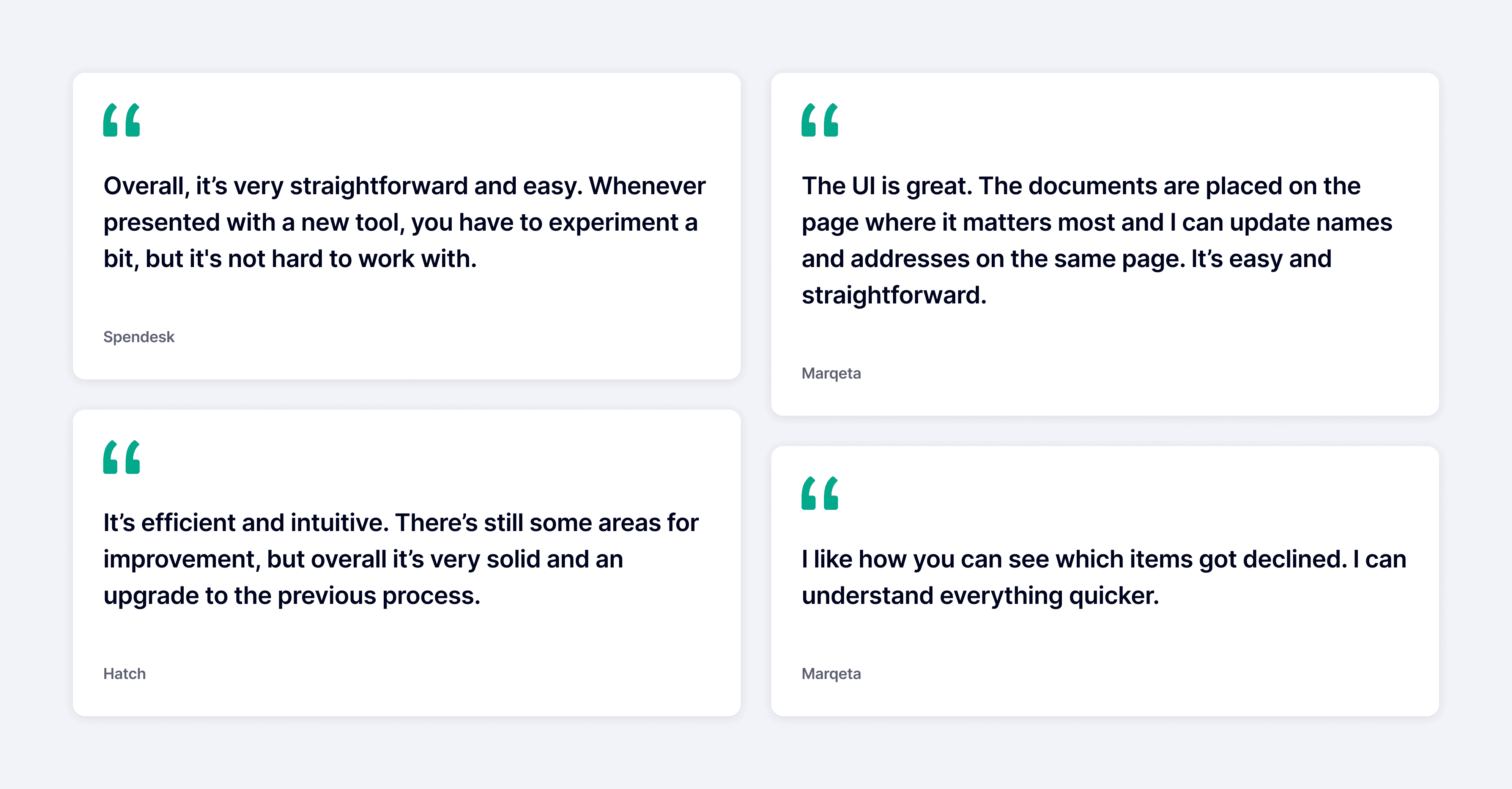
Following launch, the KYC Review Manager was met with positive feedback
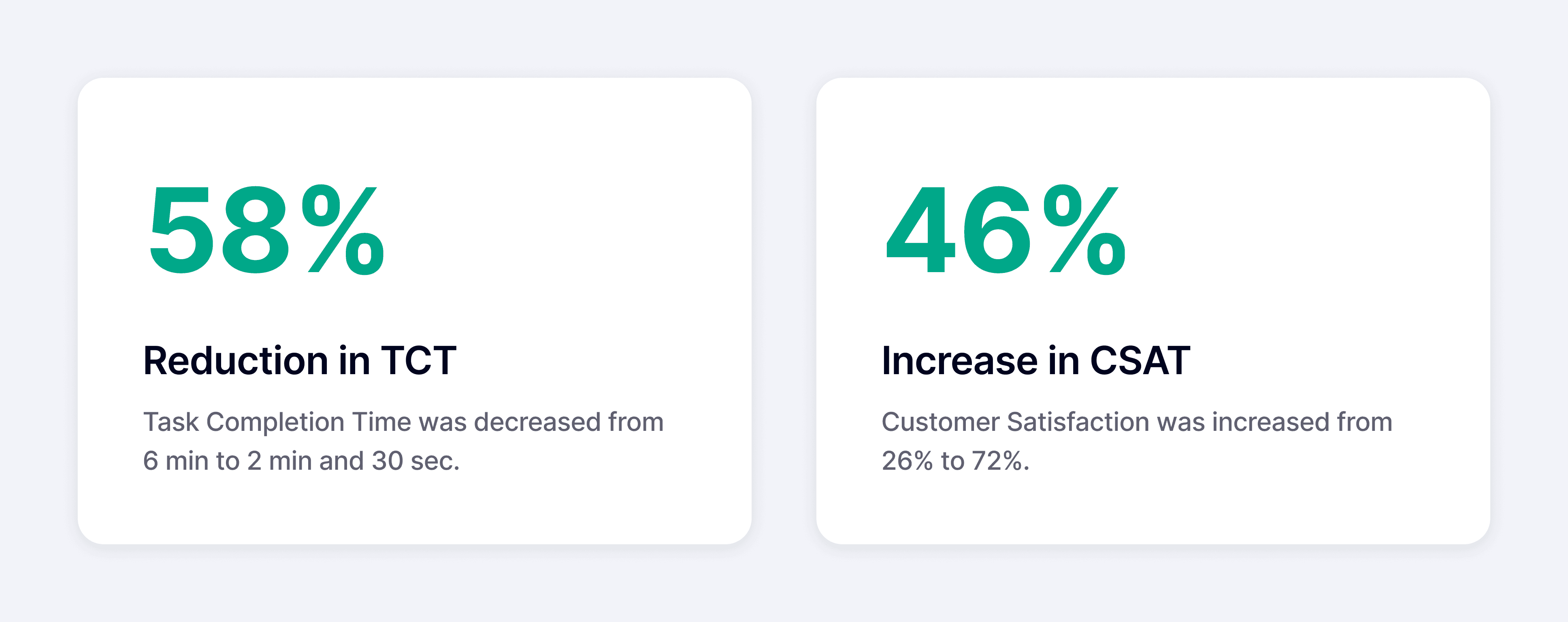
We exceeded our success metrics by significantly reducing task completion time, saving countless operational hours for risk analysts. We also surpassed our CSAT target, with users reporting a much more satisfying experience.
Takeaways
Bringing along team members
Design trade-offs can often feel abstract to teammates who aren't involved in the design process day to day. Rather than relying solely on presentations or discussions, I invited engineers who were interested to observe usability testing sessions. Watching users struggle with real tasks firsthand gave them a deeper understanding of the problems we were solving and the rationale behind key design decisions. This shared experience made trade-off discussions more productive and strengthened alignment across the team overall.