Duplicate Management
Senior Product Designer
2025

PROBLEM
Duplicate records eroded trust in the platform
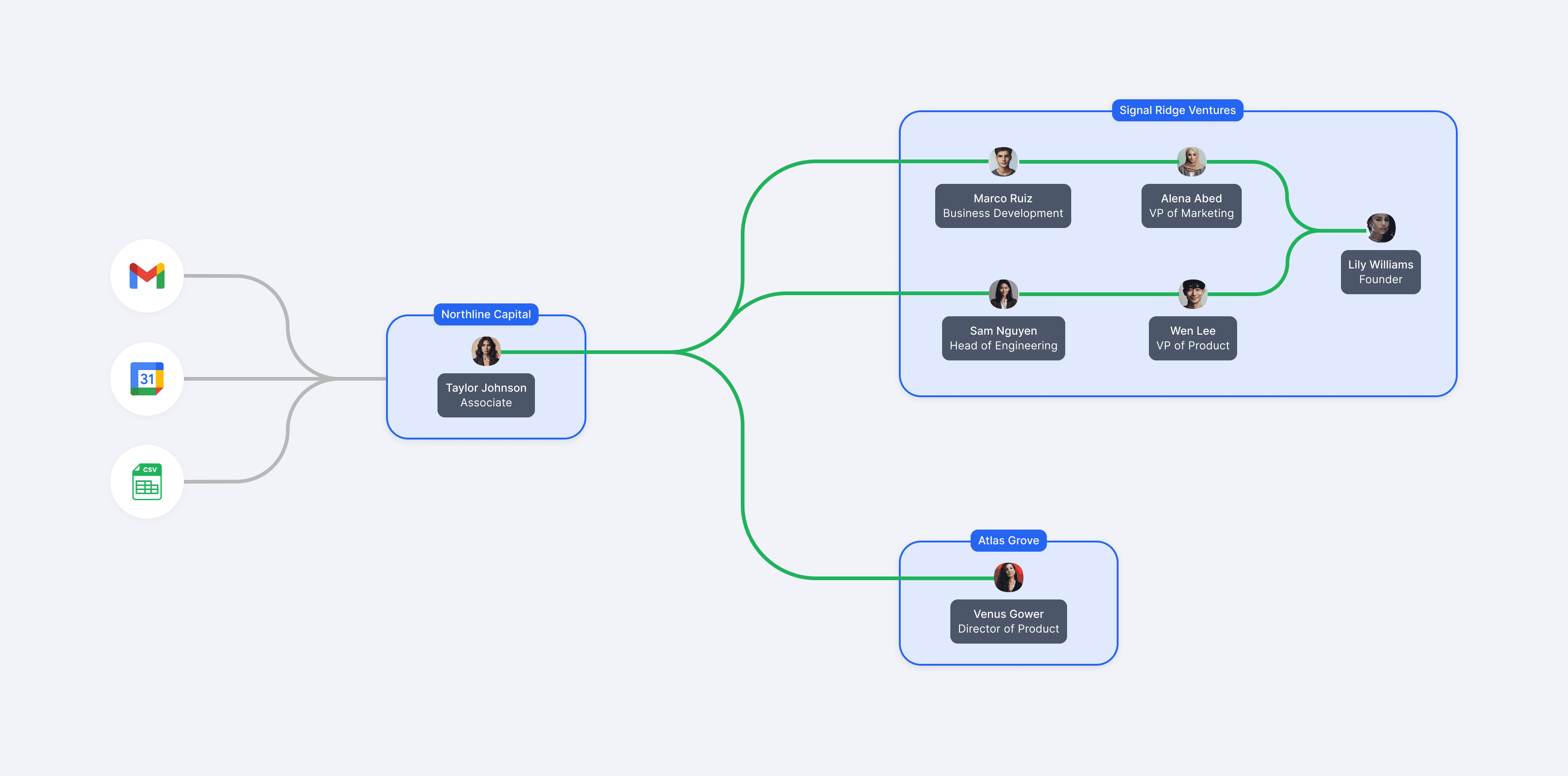
Affinity is a CRM that helps investors uncover opportunities within their relationship network. Since its insights are only as reliable as its underlying data, data quality is fundamental to the platform's value proposition. However, since data is automatically imported from sources like email, calendars, and CSVs, duplicate records often emerge, which can erode trust in the insights customers rely on.
At the time, Affinity was focused on a company-wide initiative called Nail the Basics, prioritizing core product quality over new features. Reducing duplicate records became a key initiative after customers consistently identified data quality as one of their biggest pain points.
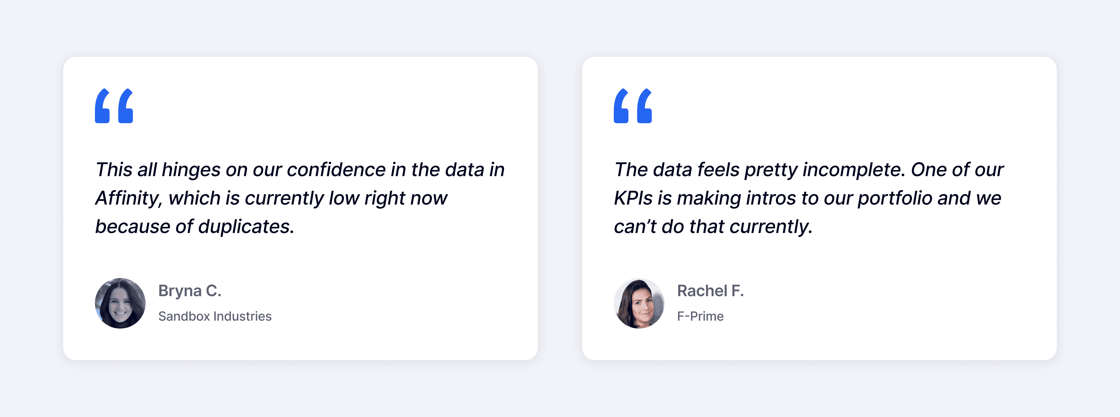
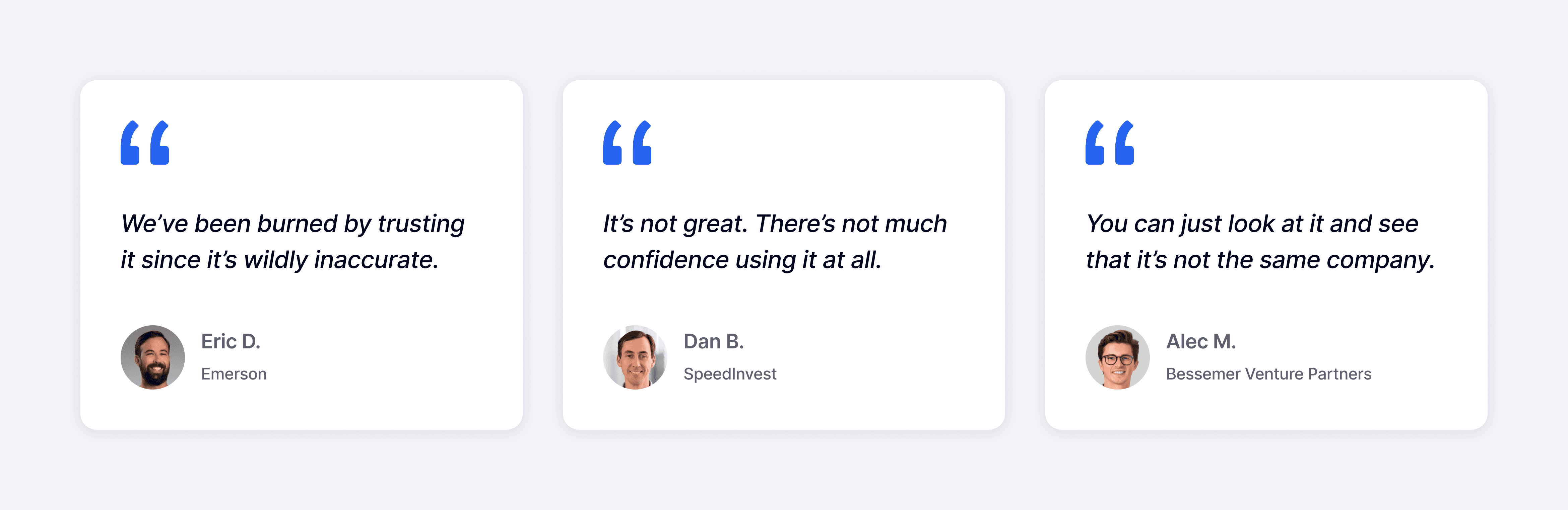
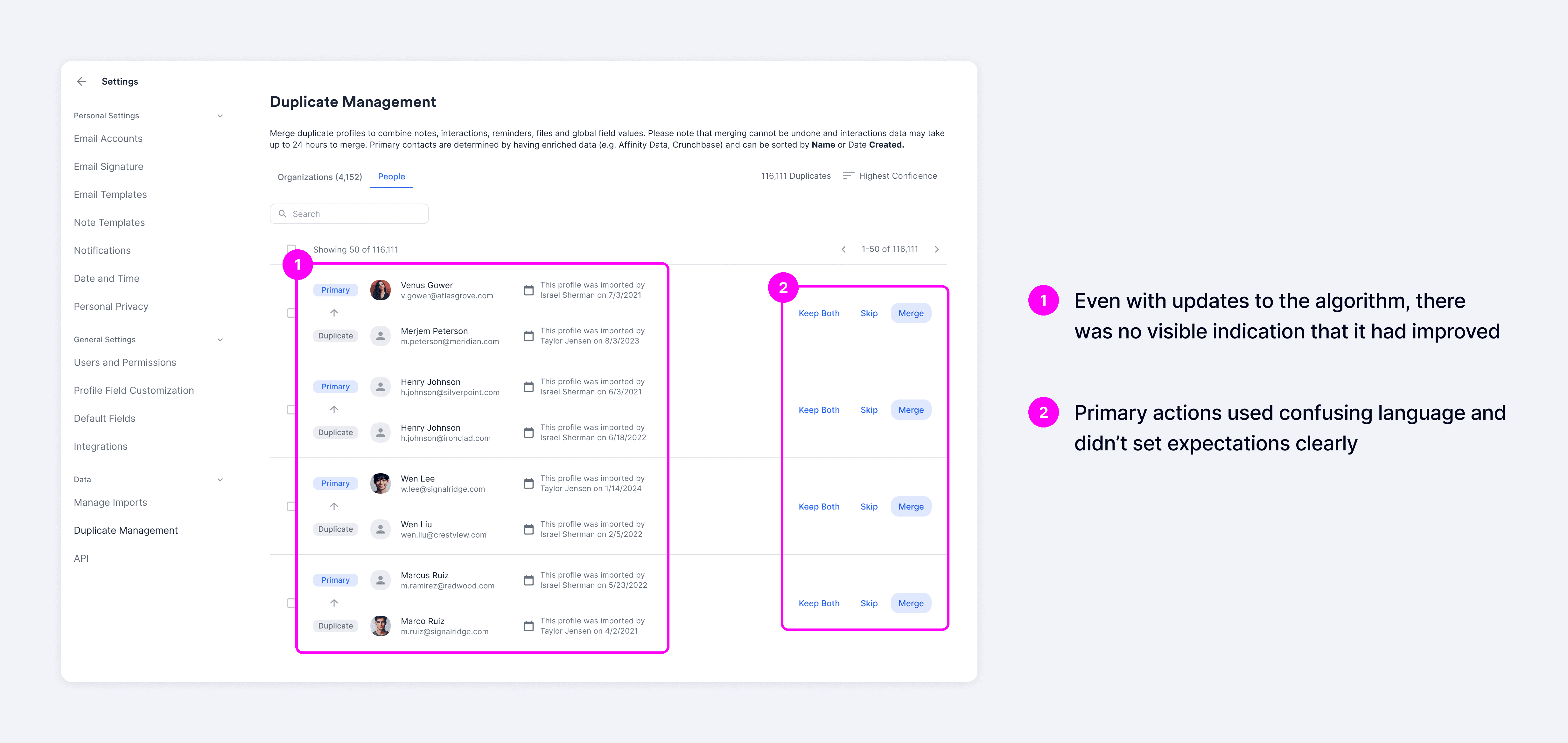
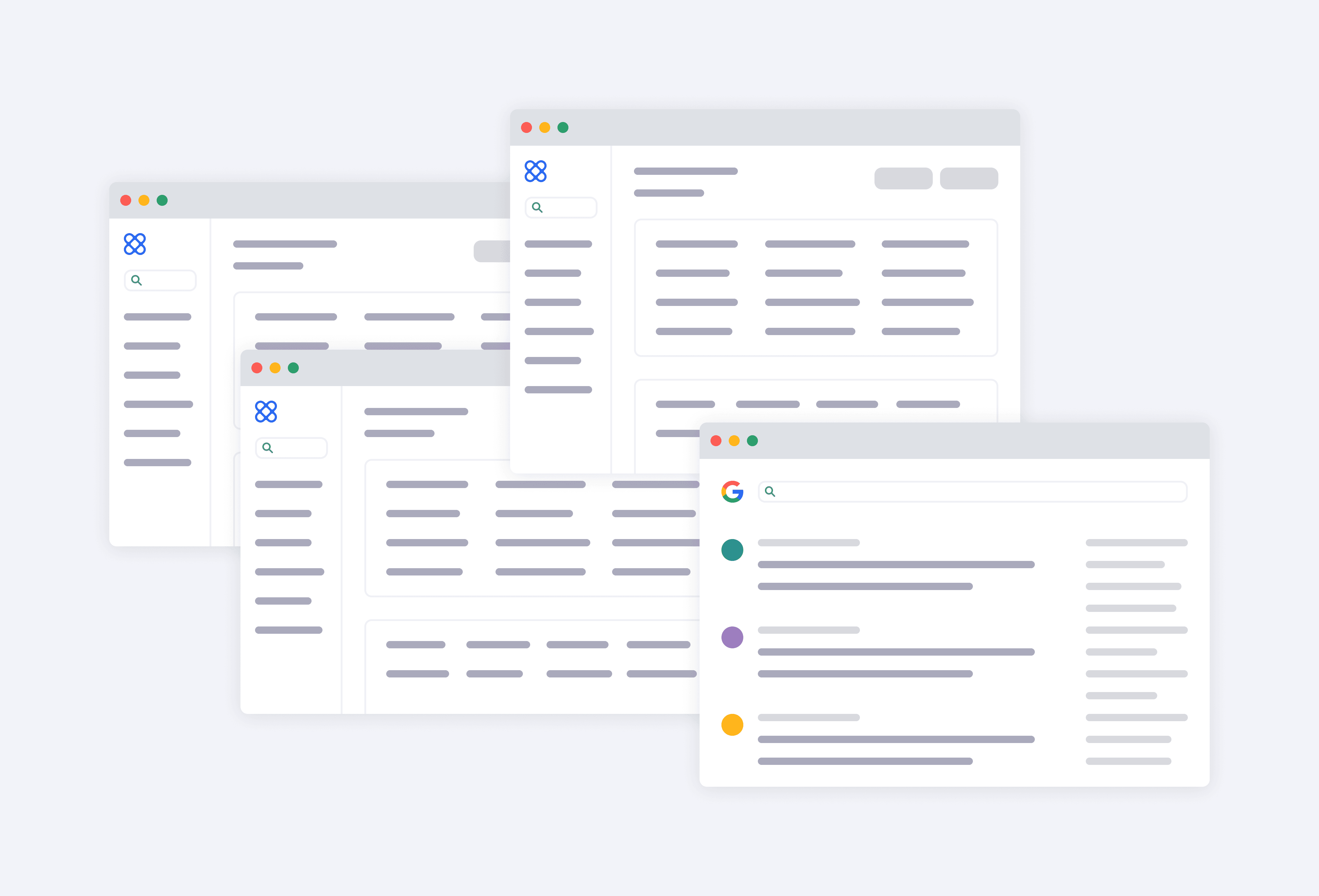
Although Affinity already offered a Duplicate Manager at the time, users rated it just 1.6 out of 5 for usefulness, and more than 100+ customers had requested improvements. The biggest issue wasn't just match accuracy—but it was also trust. The system often surfaced false positives, and even as the matching algorithm improved, users had no visibility into why records were recommended, which left them skeptical of the results.
Instead, most customers just manually navigated between different pages to merge duplicates, making an already repetitive task even more time-consuming.
Hypothesis
Building trust to drive efficiency and improve data quality
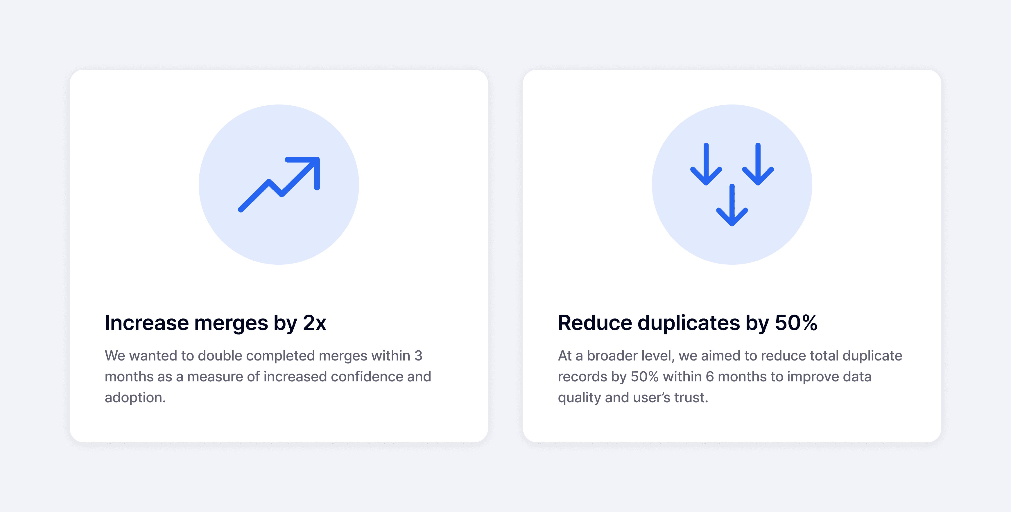
Our goal was to add more transparency and give users the context they needed to feel confident committing merges. We hypothesized that giving users greater visibility into record details and control over merge outcomes would increase their confidence in completing merges.
To measure success, we wanted to increase usage through higher merge rates with the expectation that it would reduce duplicates in the system and improve overall data quality.
Explorations
Balancing immediate needs with long-term scalability
I explored a range of design concepts focused on giving users control over the underlying data. These included two primary patterns: an accordion layout optimized for speed and efficiency, and a full-page layout designed to support deeper evaluation.


One of the most requested features from customers was the ability to undo a merge, which helped give them more confidence to commit without worrying about making mistakes. Unfortunately, the engineering complexity of supporting this feature made it out of scope for this release.
As a workaround, I introduced a live preview of the merged record in the full-page layout, which helped compensate for the lack of an undo feature by making the outcome transparent before users committed to a merge.

I connected with customers and walked them through each concept to gather feedback. When comparing the two patterns, the accordion layout was perceived as more efficient and allowed users to quickly scan details without needing to navigate elsewhere, while the full-page layout was more comprehensive — the live preview was received well and validated our assumption that giving users visibility into the merge outcome helped build more trust.
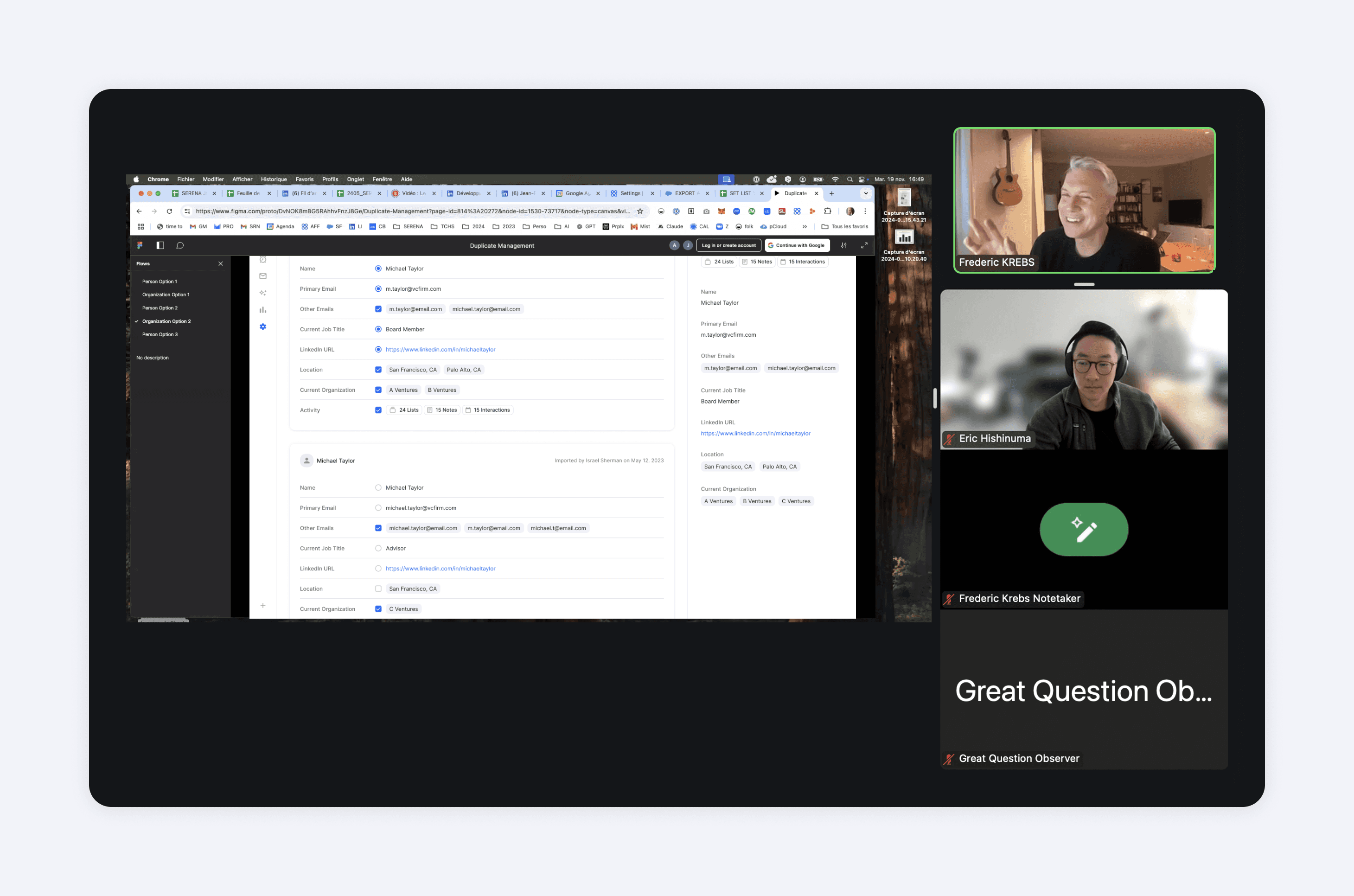
We ultimately moved forward with the full-page layout because it prioritized trust over speed, which was an essential factor in giving users the confidence to merge more records.
We refined the design based on feedback, which included things like placing fields adjacent to one another to make record comparison faster and easier.

Usability Testing
Addressing friction points identified in testing
After multiple rounds of iteration, we conducted usability testing to validate the experience. While participants completed the core tasks with little difficulty, the sessions uncovered a few usability issues that we addressed before launch.
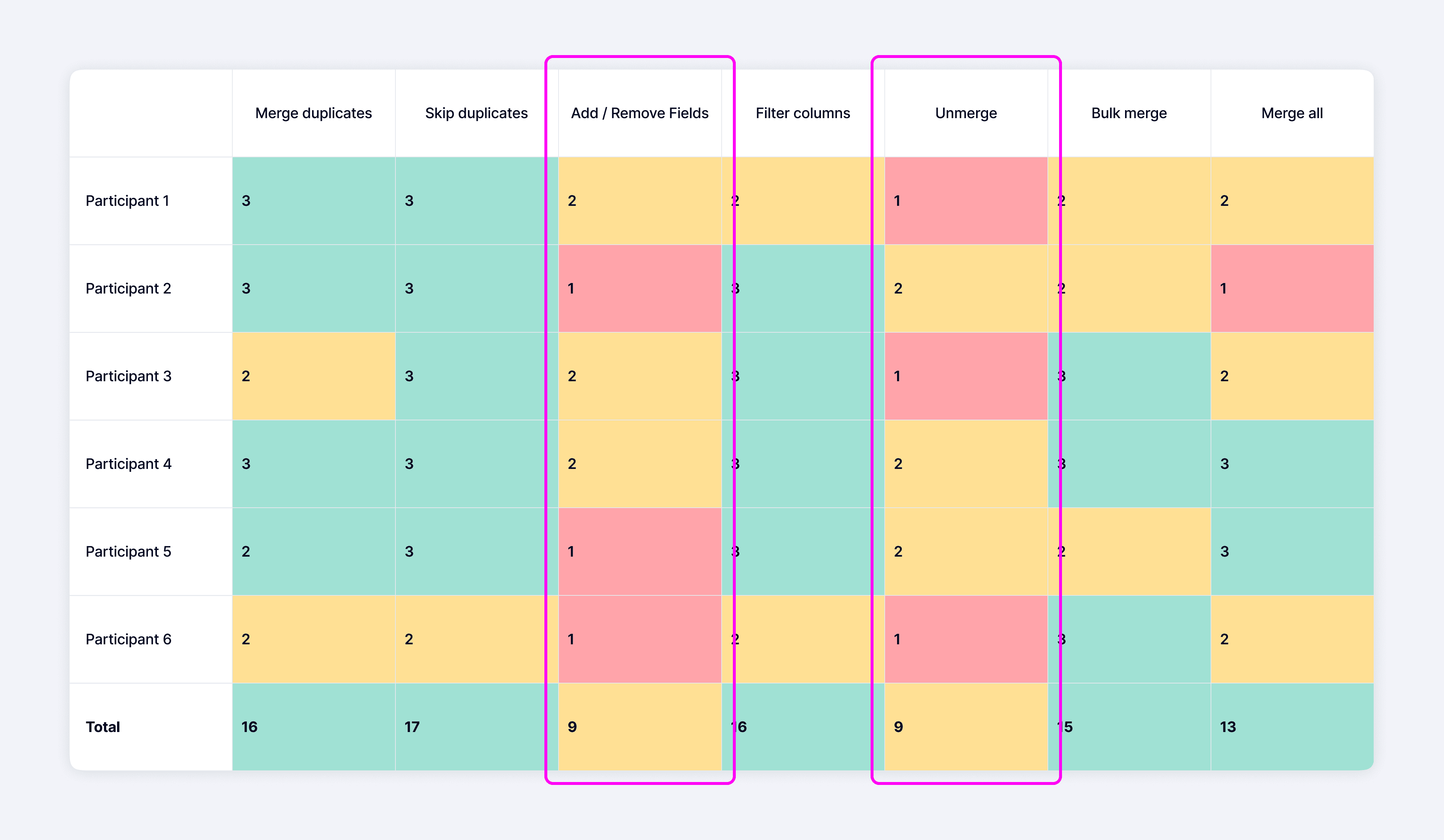
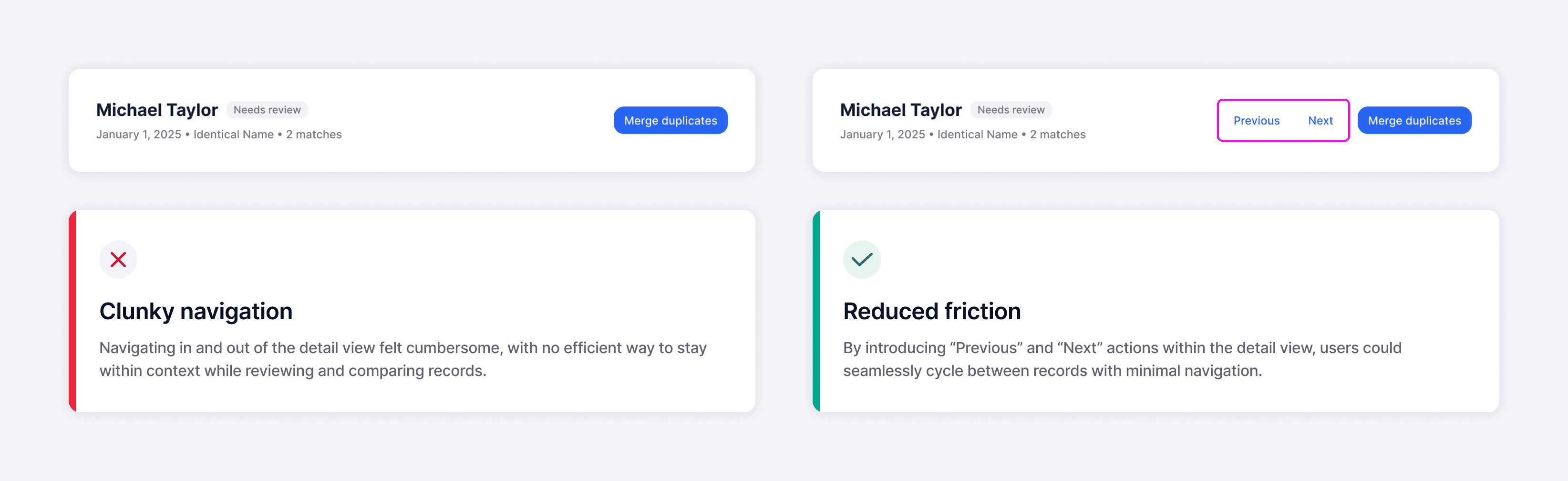
Although the full-page layout was optimal for building trust, users told us the workflow could better support speed, similar to the original accordion concept. To address this, we introduced an easy way to cycle through duplicate sets while staying within the detail view, which allowed for users to move faster without losing context.
Earlier on, we also identified a core set of fields that users consistently referenced when assessing potential duplicates. My initial approach was to surface only those fields, keeping the interface focused and avoiding unnecessary clutter.

However, after syncing with engineering, we learned that displaying those fields would require significant refactoring and wasn't feasible within our timeline. As a workaround, I made the record details expandable and collapsible, which kept information readable and reduced cognitive overload.
This was one of several trade-offs I made with engineering throughout the project. Instead of abandoning the original intent, I looked for feasible alternatives that preserved as much of the experience as possible.

Final Designs
Reducing uncertainty before merging

While users expressed a strong need to control the underlying data, they also found significant value in seeing signals like match reasons and confidence scores, which provided far more context than the previous experience.
In the main list view, our goal was to surface as many relevant signals as possible so users could quickly assess matches and take action.
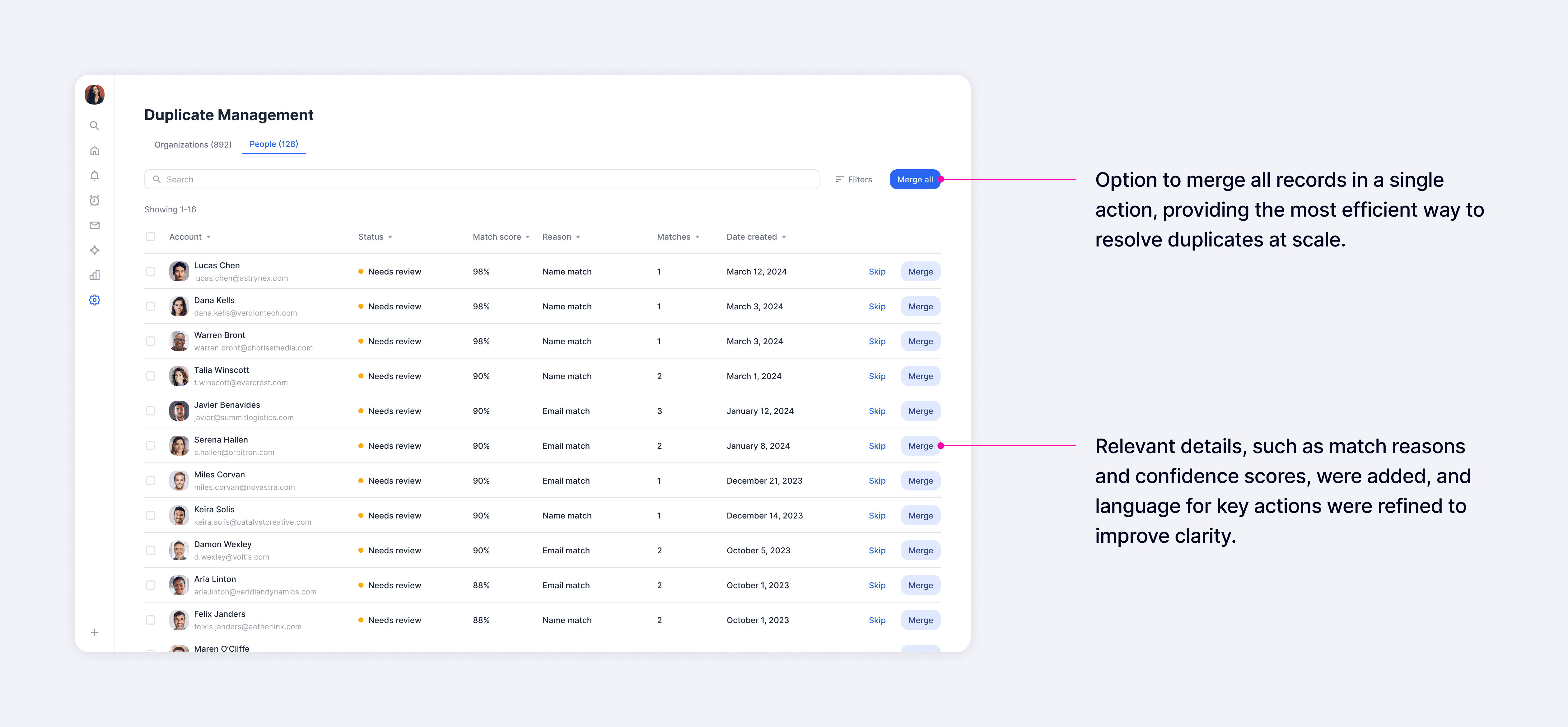
For deeper evaluation, the detail view presented all fields side by side, which made it easy to compare records and choose which values to carry into the merged result. A real-time profile preview showed the final outcome as users made selections, which helped them understand exactly what would happen before committing a merge.

As trust increased, users could shift to bulk merging for greater efficiency. While most preferred to carefully review each merge, a segment of power users had no time to inspect and wanted to act immediately. Supporting both behaviors was essential for us to meet different user needs.

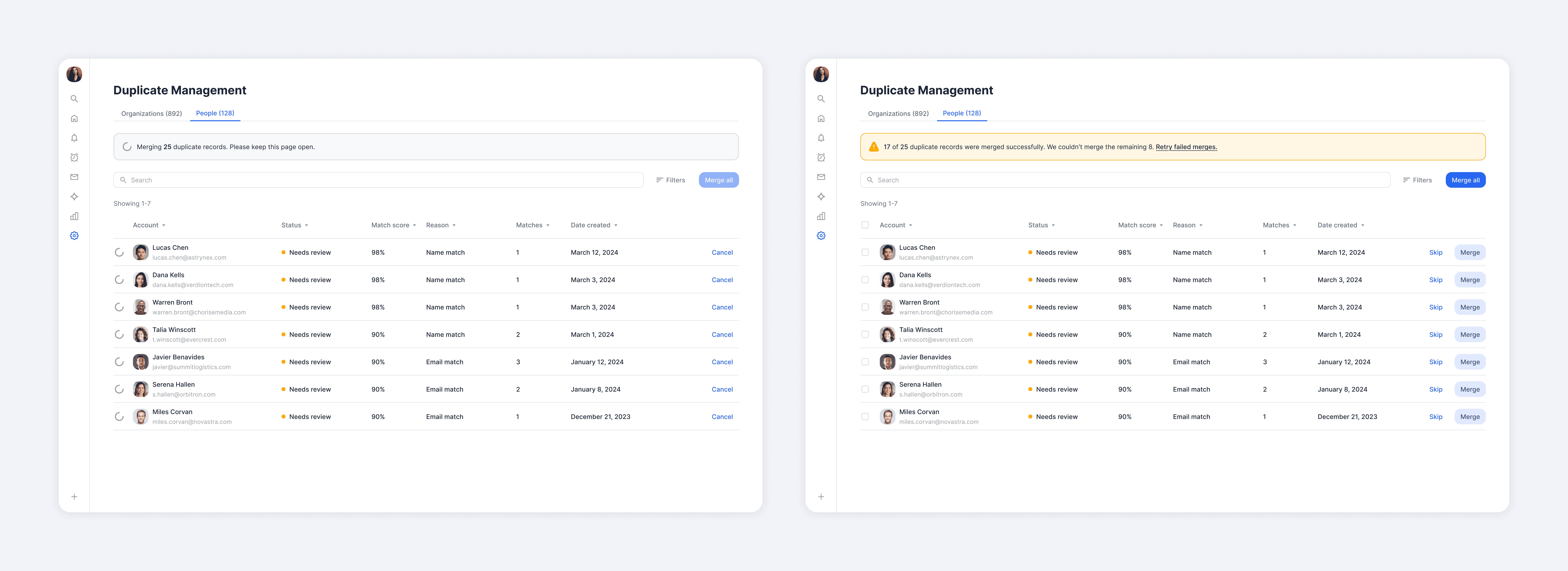
We didn't want to just optimize for the happy path though. Through cross-functional review sessions, engineering raised some concerns about the latency involved in bulk merging records. I accounted for this issue by designing different loading states that helped keep users informed about what was happening while a merge was in progress.
I carried that same principle of transparency throughout the experience by clearly communicating system status and providing straightforward recovery paths when something went wrong. Rather than interrupting users with modals or toasts, I leveraged a lot of inline messaging to keep the system feedback persistent and contextual.
Impact
Measuring impact through quantitative and qualitative feedback
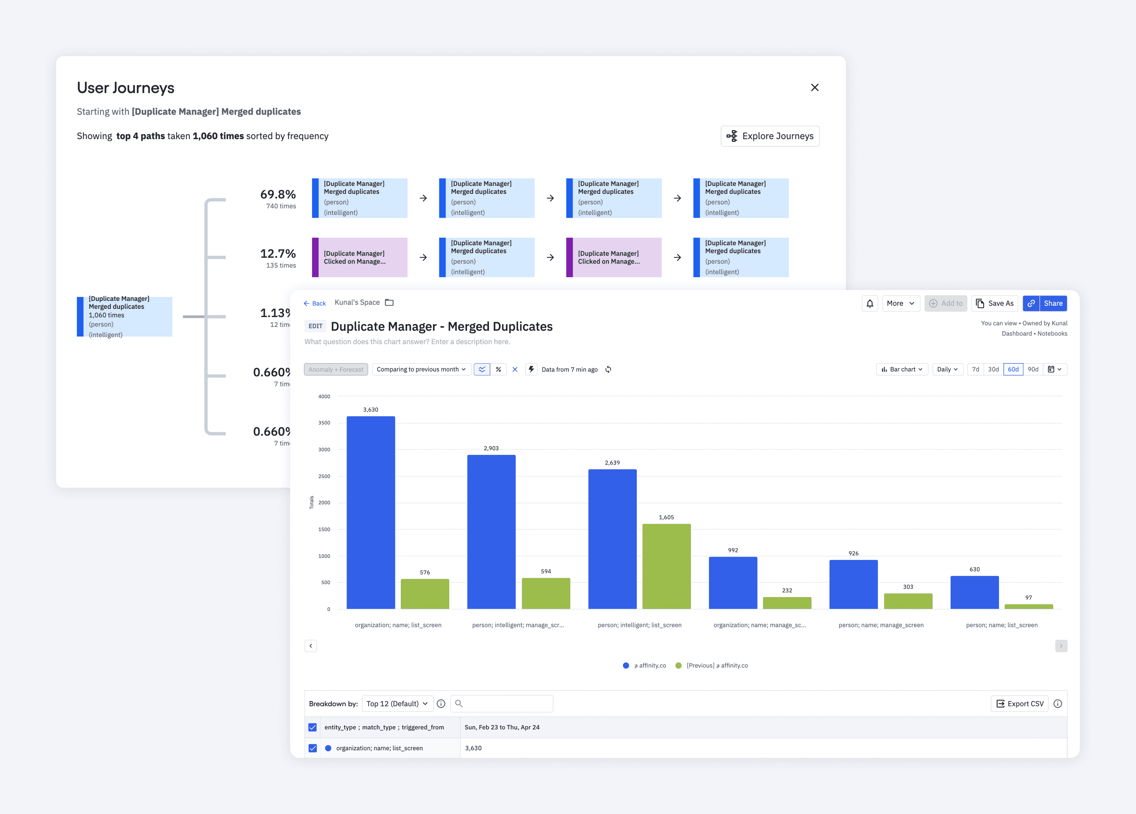
Within three months after launch, we saw a 530% increase in company merges and a 200% increase in people merges, which exceeded our adoption goals. Within six months, duplicates also decreased by 55%, which demonstrated significant improvements in data quality.
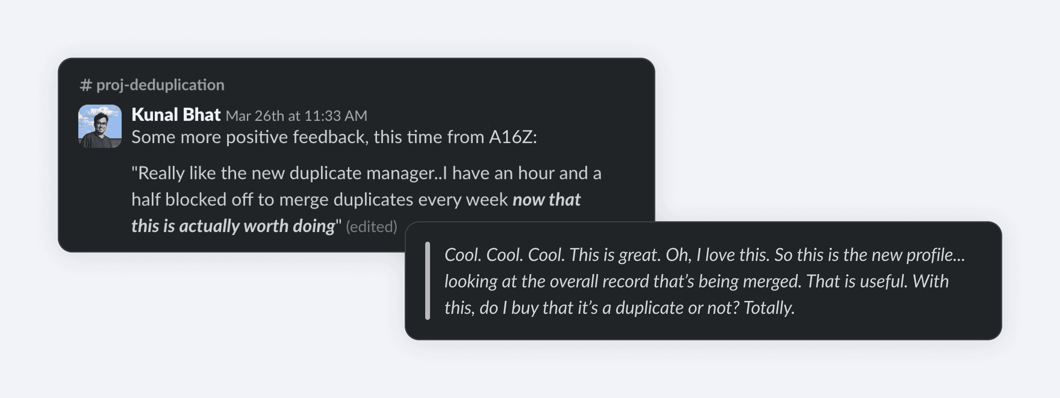
After launch, we also received positive feedback from our Big 10 Customers, whom we consistently prioritized due to their significant impact on our revenue.
Takeaways
Staying focused through constraints
This project served as a reminder that good design is often about making the right trade-offs without losing sight of the core problem. Earlier on, we aligned on the fact that our goal was not to build the most feature-rich tool, but it was to increase users' trust in the merge process — this gave us a clear principle for making decisions throughout the project.
There were moments when I had to scale back parts of the design due to technical constraints, but through that, I tried staying focused on preserving elements of the design that were directly tied to building user confidence. Keeping that principle in mind made it easier to prioritize what mattered most and let go of ideas that weren't as essential to achieving that goal.