Duplicate Management
Senior Product Designer
2025

Background
The cost of duplicates
Investors at venture capital firms are always searching for their next breakout company, one successful investment can transform their firm's reputation and define their entire career, so it's no surprise investors gravitate toward tools that help give them a competitive edge.
A tool like Affinity can help investors do their jobs better by surfacing insights in their current network that uncover opportunities they might have otherwise not seen.
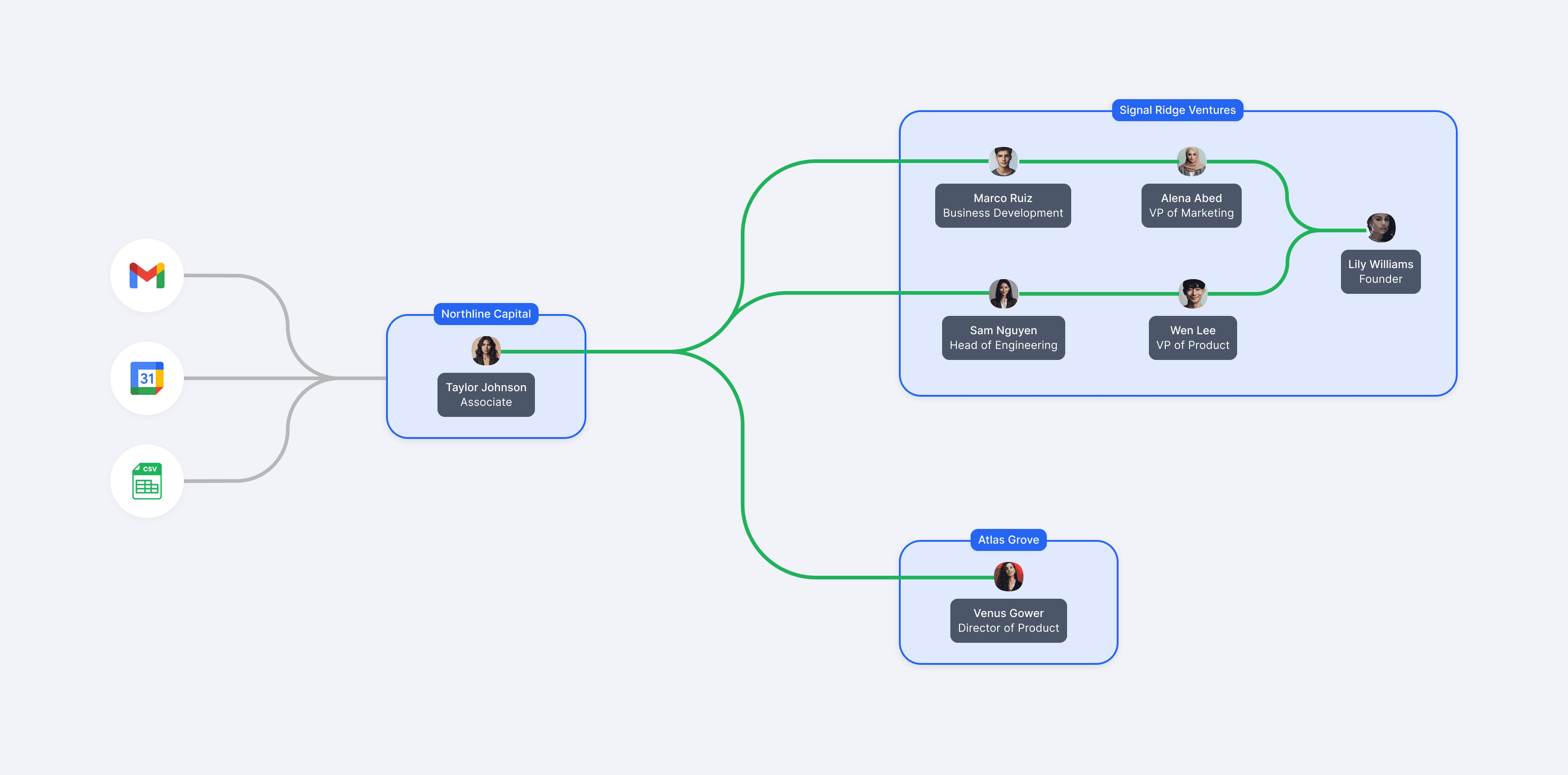
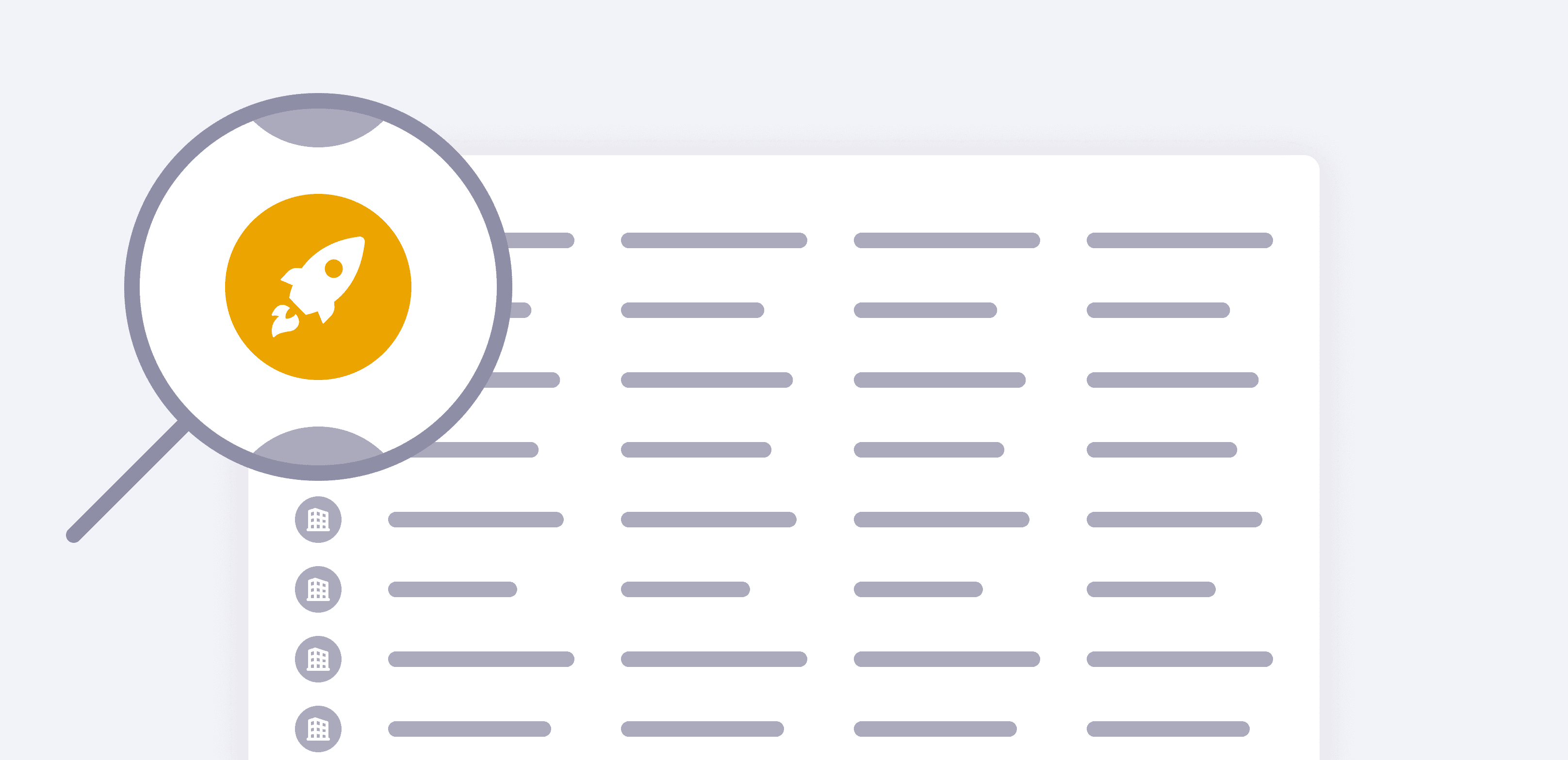
Since these insights are at the foundation of the Affinity platform, clean and accurate data is absolutely essential. However, since data is primarily imported from multiple sources, such as emails, calendars, and CSVs, duplicates can often surface, which creates confusion and prevents users from seeing accurate insights.

At the time of this project, Affinity was in the midst of a company-wide initiative to Nail the Basics, a strategy focused on strengthening the platform's foundation. This initiative was driven by a lion's share of customer feedback where trust in the data was prioritized over adding shiny new features.
Reducing duplicates naturally became a key part of this initiative to establish a strong base for data quality before building toward more advanced capabilities.

👥 Team
I worked in a cross-functional squad that included 1 PM, 2 front-end engineers, and a team of back-end engineers.
💼 Role
I was the sole designer and led the end-to-end design process from problem definition through launch.
PROBLEM
The current experience was seen as inaccurate and untrustworthy
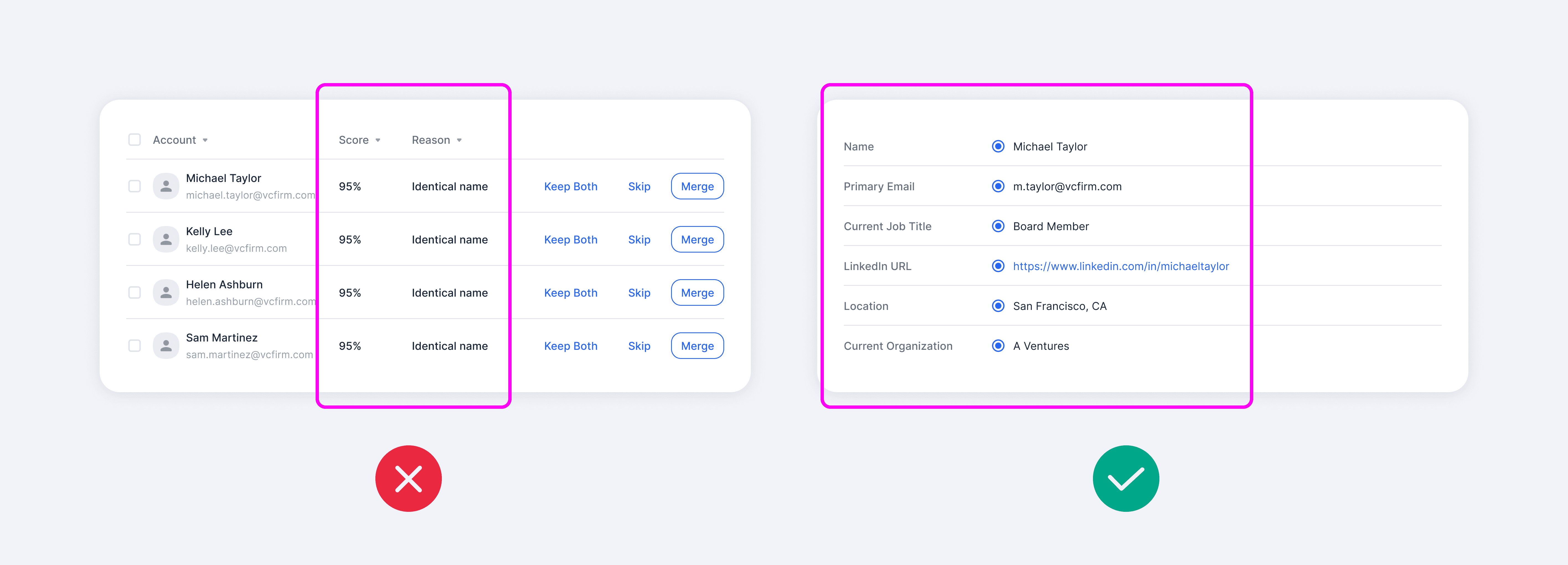
At the start of the project, Affinity already offered a duplicate manager that allowed users to merge duplicate people and companies. However, the experience was falling way short of customer expectations and was perceived as untrustworthy. In a survey, participants rated the current duplicate manager 1.6 out of 5 for usefulness.
Improving the duplicate manager had become one of the most requested features with more than 100+ customers submitting feedback citing frustrations.

The core issue was that the matching algorithm often displayed false positives, which eroded users' trust in the system. Even as engineering improved match accuracy, those improvements remained behind the scenes and weren't reflected in the experience, leaving users still feeling skeptical.
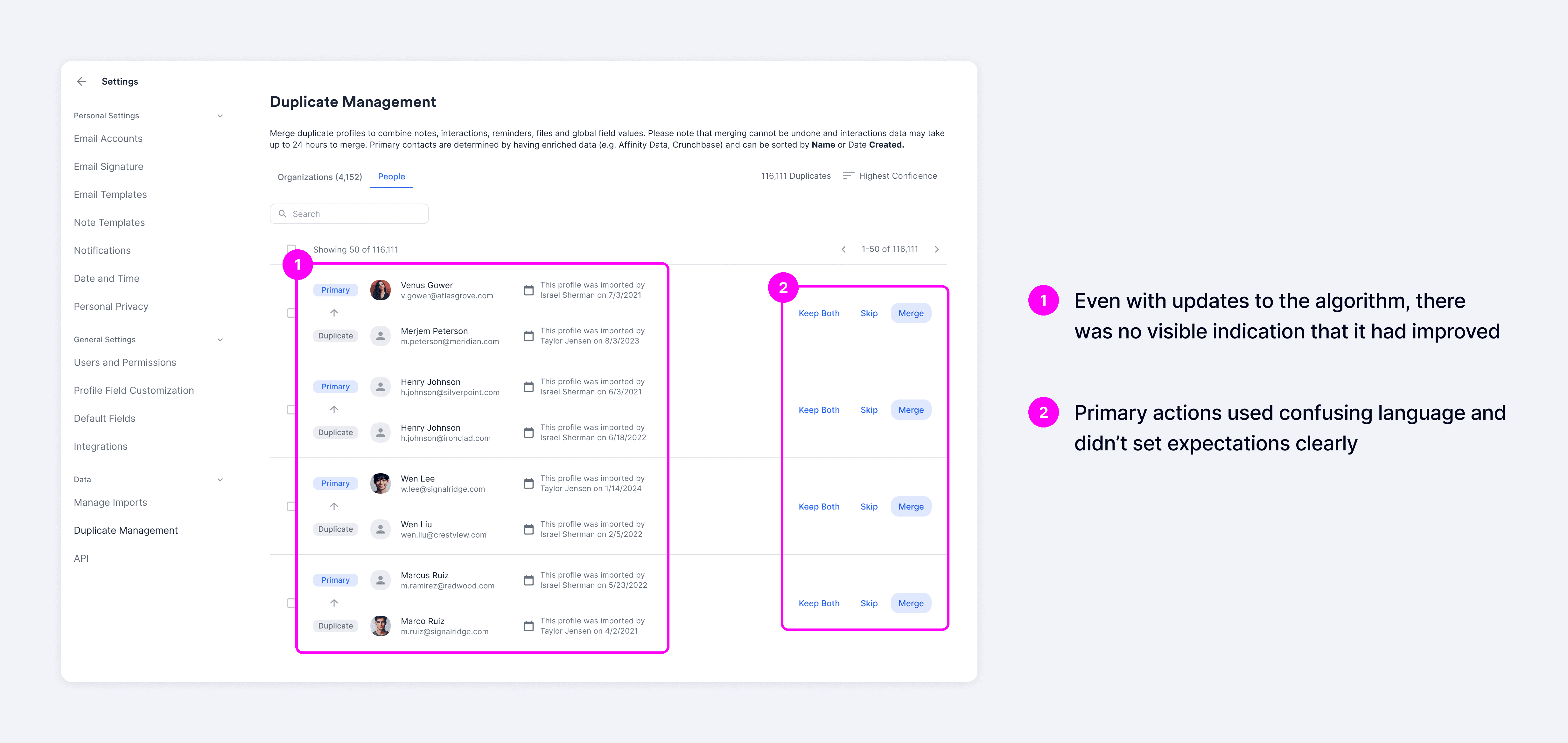
Most users just avoided the duplicate manager altogether and opted for manual workarounds like navigating to individual profiles to merge records. This added around 20 seconds per duplicate to resolve, making the process significantly more time-consuming and inefficient.

GOALS
Building trust to drive efficiency and improve data quality
Our goal was to make the system's decision-making more transparent, giving users the context they needed to feel confident committing merges.
We hypothesized that by showing how matches were determined more clearly, users would build trust over time, leading to greater confidence in committing merges, and ultimately, more efficient duplicate resolution.
To measure success, we wanted to increase usage through higher merge rates with the expectation that it would reduce duplicates in the system and improve overall data quality.

User interviews
Evolving our initial approach
We kicked off by recruiting high-usage users based on activity in Productboard and Amplitude to better understand underlying behaviors. Through user interviews and problem-definition sessions with cross-functional partners, we uncovered deeper insights into the root causes of low usage.

A key takeaway from these conversations was that even with added transparency, such as match reasons and confidence scores, users still didn't fully trust the system due to their prior negative experiences with inaccurate matches.
This led us to shift our approach from more surface-level transparency to enabling users to see and validate the data themselves. Users wanted to compare fields across records and control which values would be carried into the merged result to feel confident taking action. Once trust was established, they expressed a desire to merge in bulk for better efficiency.
Explorations
Designing with the long-term in mind
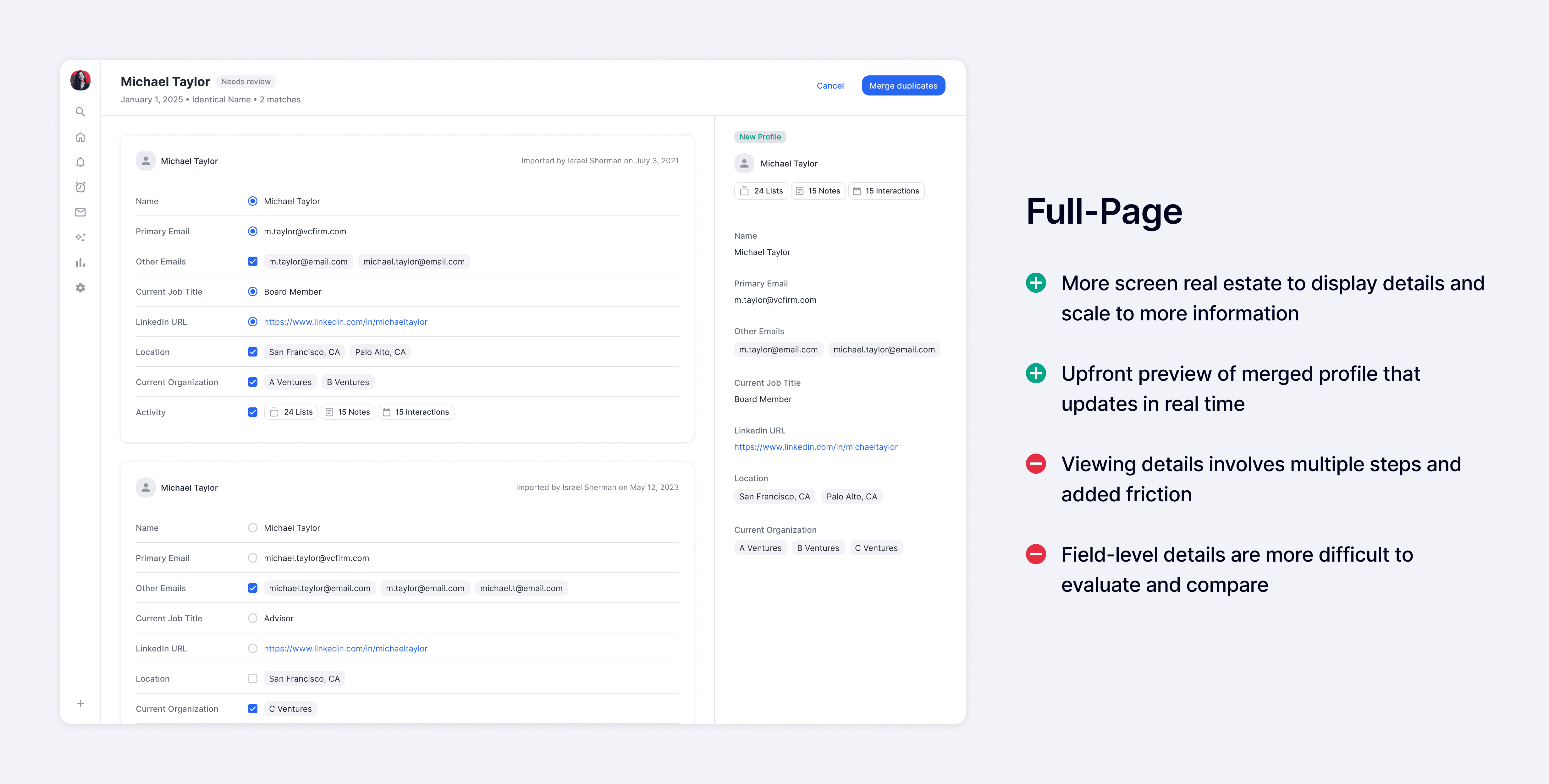
With the new shift in approach, I explored a range of design directions focused on giving users visibility into and control over the underlying data. These included two primary patterns: an accordion layout optimized for speed and efficiency, and a full-page layout designed to support deeper evaluation and build trust.
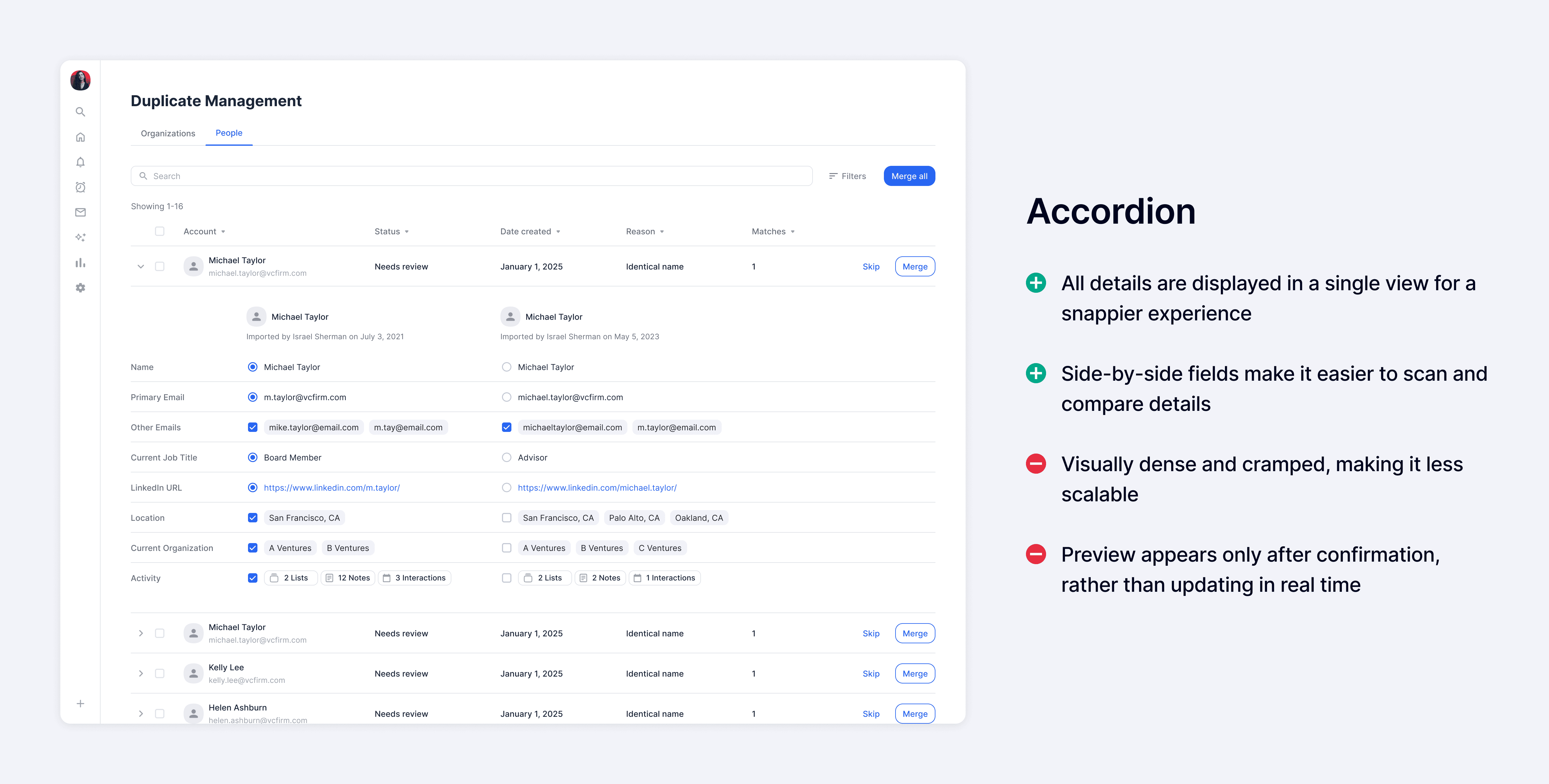
I reconnected with customers and conducted prototype sessions, walking them through each concept to gather feedback. Across the board, the ability to see and control data at the field level was strongly validated and received positively.

When comparing the two patterns, the accordion layout was seen as more efficient and allowed users to quickly scan details without needing to navigate elsewhere, while the full-page layout was more thorough and provided a more focused environment.
Although the accordion pattern offered greater efficiency, we chose to move forward with the full-page layout since our goal was to enable users to confidently adopt bulk merge as their primary workflow. The full-page layout better provided the depth and clarity needed to build that trust.

Usability Testing
Addressing friction points identified in testing
After multiple rounds of feedback, we conducted usability testing with six participants. While users were able to complete most core tasks with ease, the sessions surfaced a few areas where they struggled or identified opportunities for improvement, which we addressed following the testing.

After sharing the usability testing results with the broader product organization, we aligned with engineering to assess feasibility and prioritized updates that were low effort and high impact.


Final Designs
All roads lead back to building trust
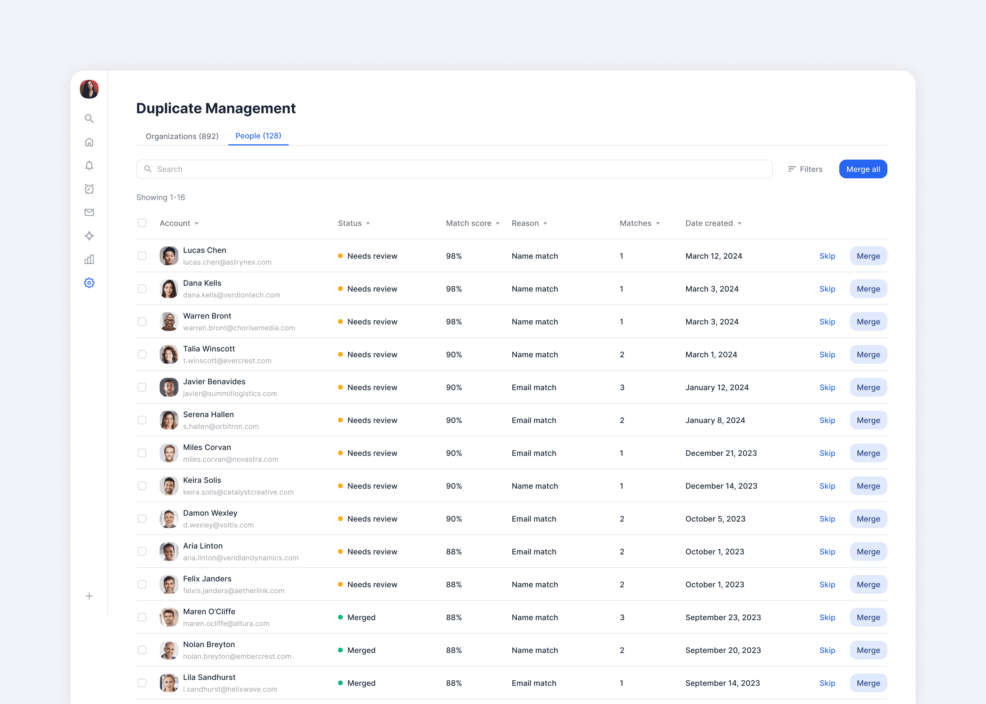
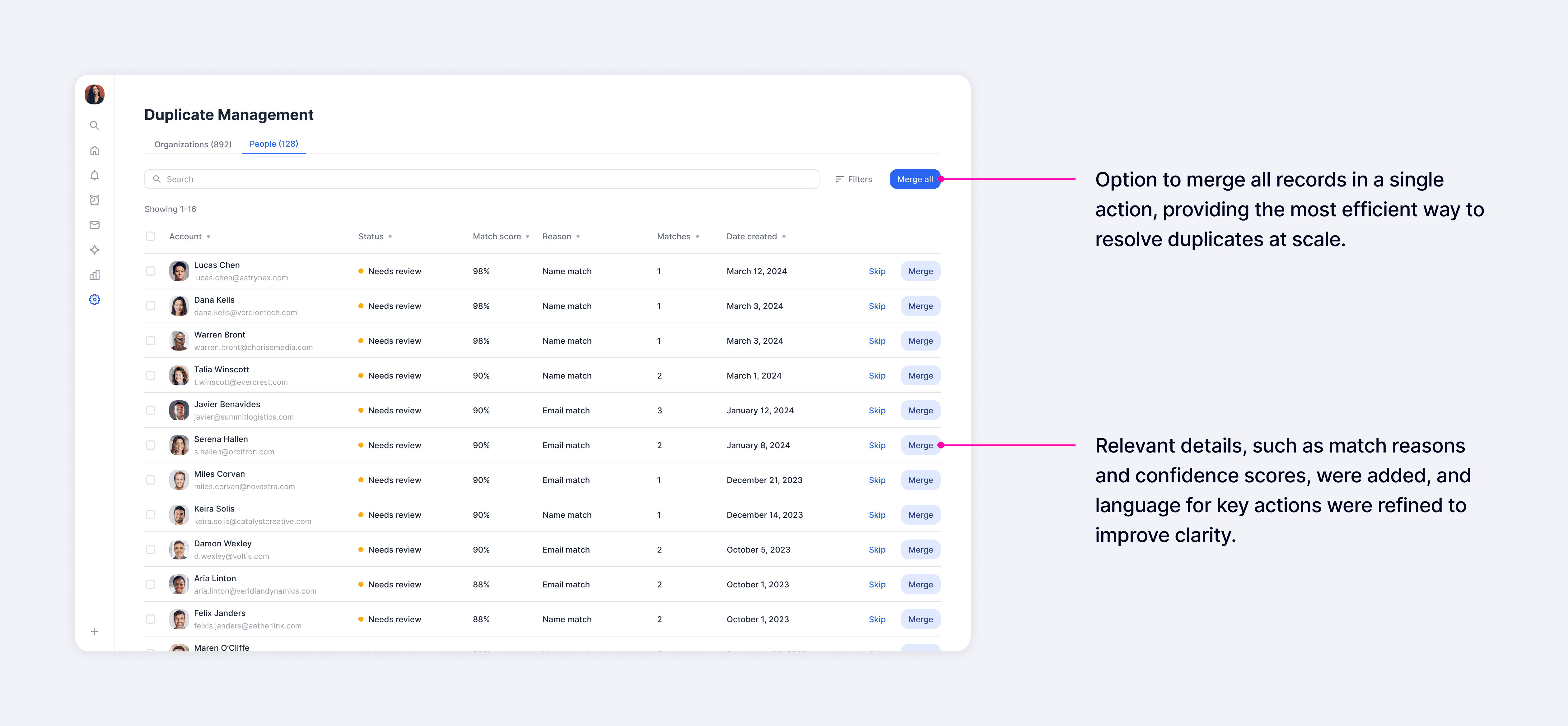
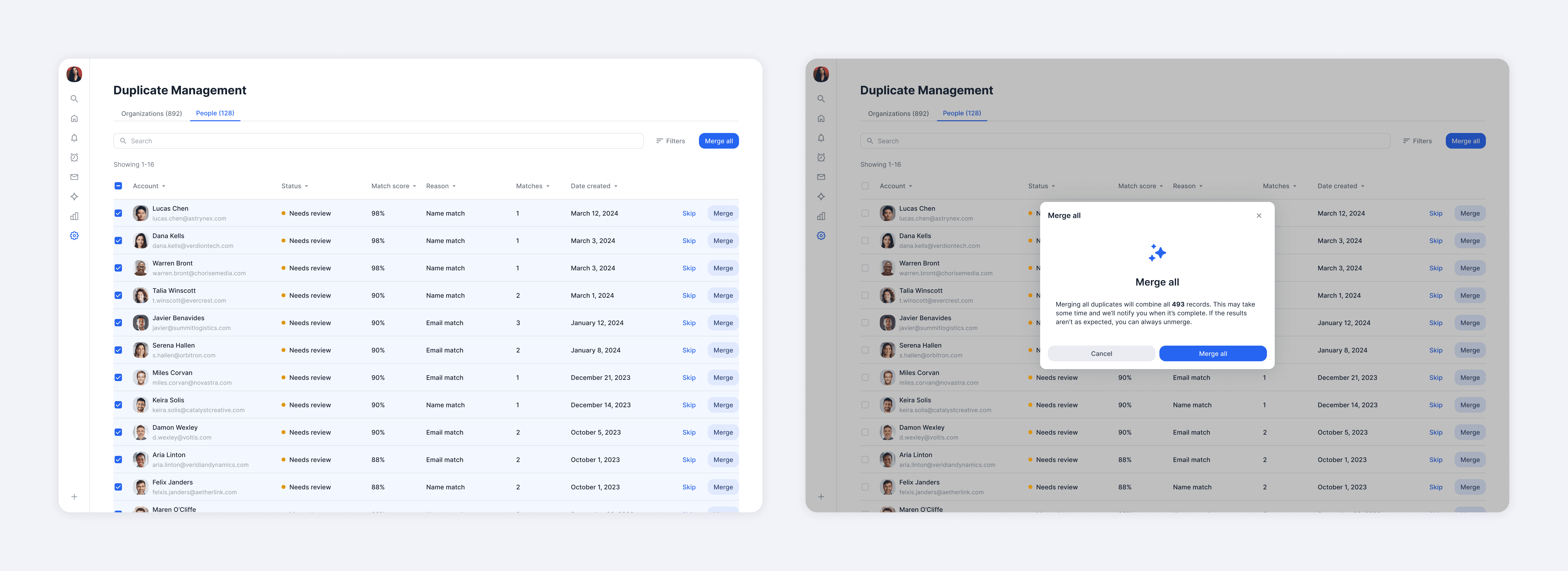
While users expressed a strong need to see and control the underlying data, they also found significant value in seeing signals like match reasons and confidence scores, which provided far more context than the previous experience. In the list view, our goal was to surface as many relevant signals as possible so users could quickly assess matches and take action directly when they felt confident.
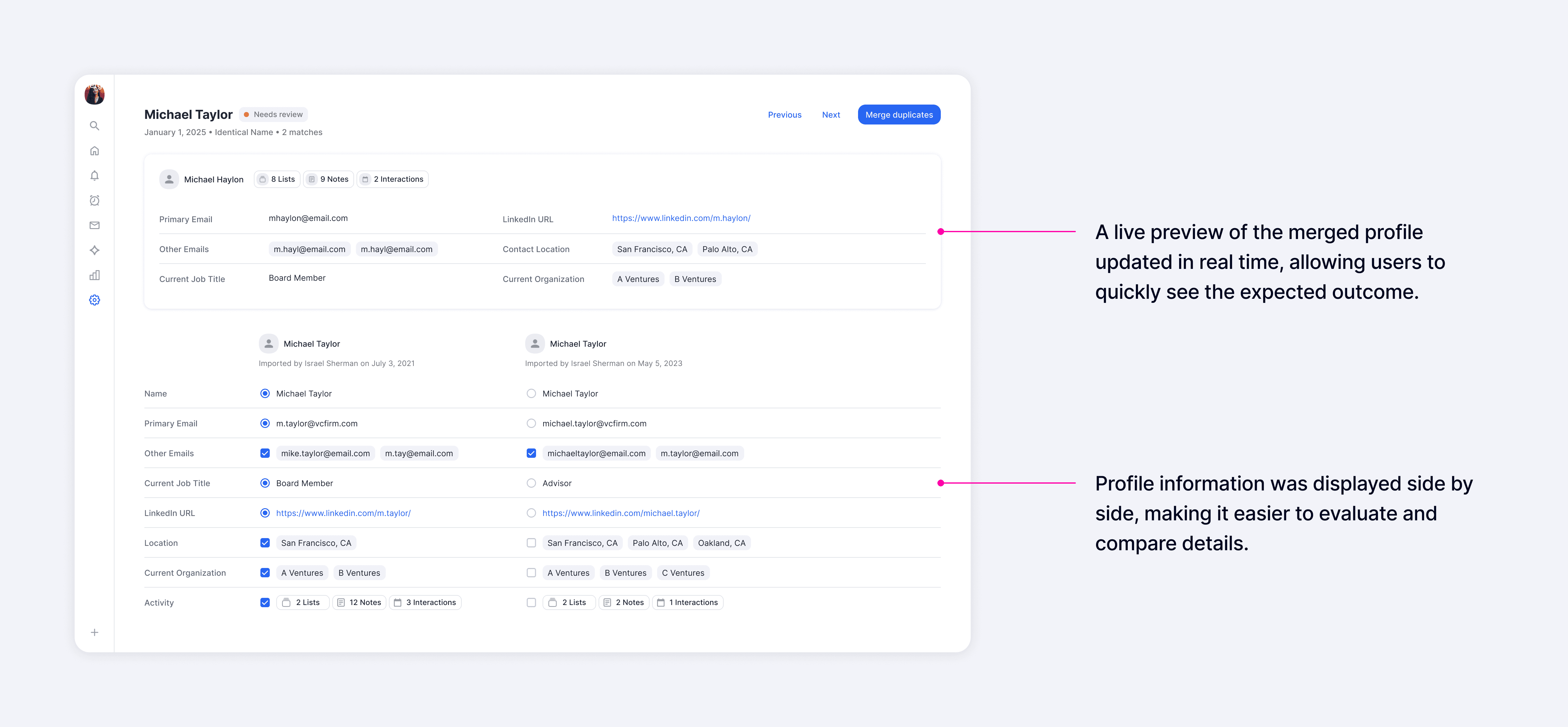
For deeper evaluation, the detail view presented all fields side by side, making it easy to compare records and choose which values to carry into the merged result. A real-time profile preview showed the final outcome as users made selections, helping them understand exactly what would happen before committing a merge.
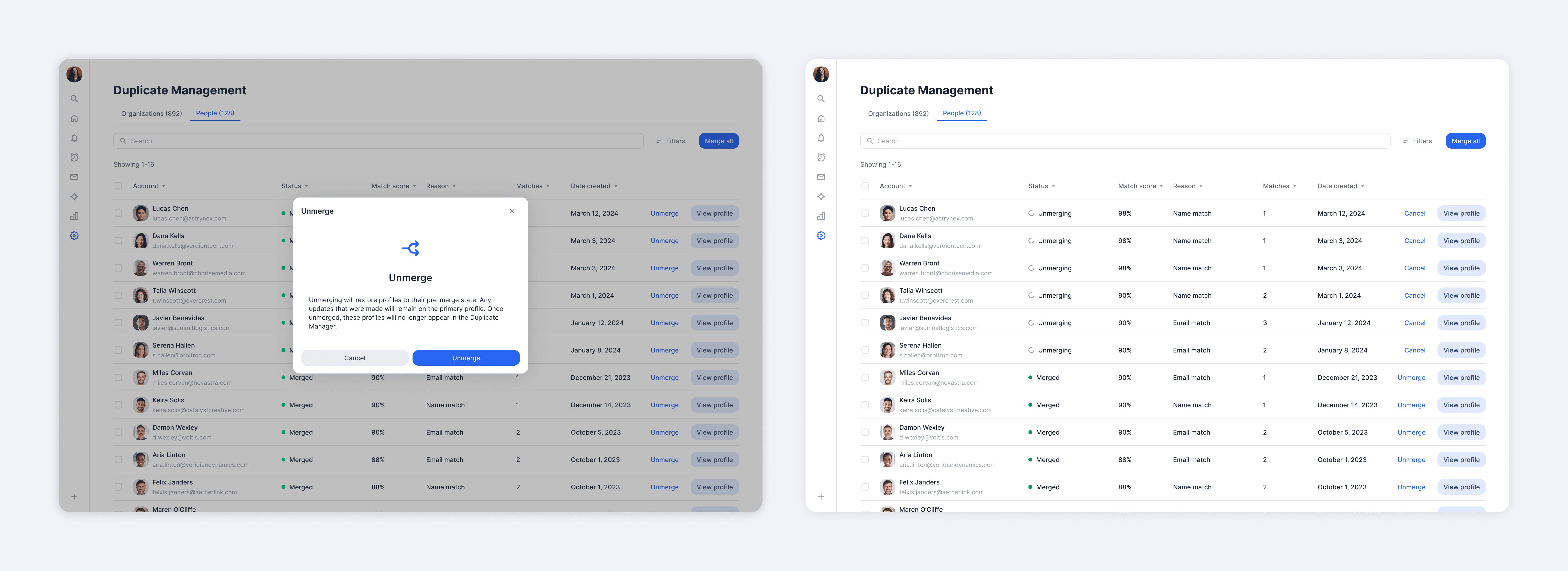
To further reduce risk, we introduced the ability to unmerge, which was consistently highlighted in interviews as a key driver of confidence. This gave users reassurance they could safely take action, knowing mistakes could easily be reversed.
As trust increased, users could shift to bulk merging for greater efficiency. While most preferred to carefully review each merge, a smaller segment of users had no time to inspect and wanted to act immediately. Supporting both behaviors was essential for us to meet different user needs.
Impact
Measuring impact through quantitative and qualitative feedback
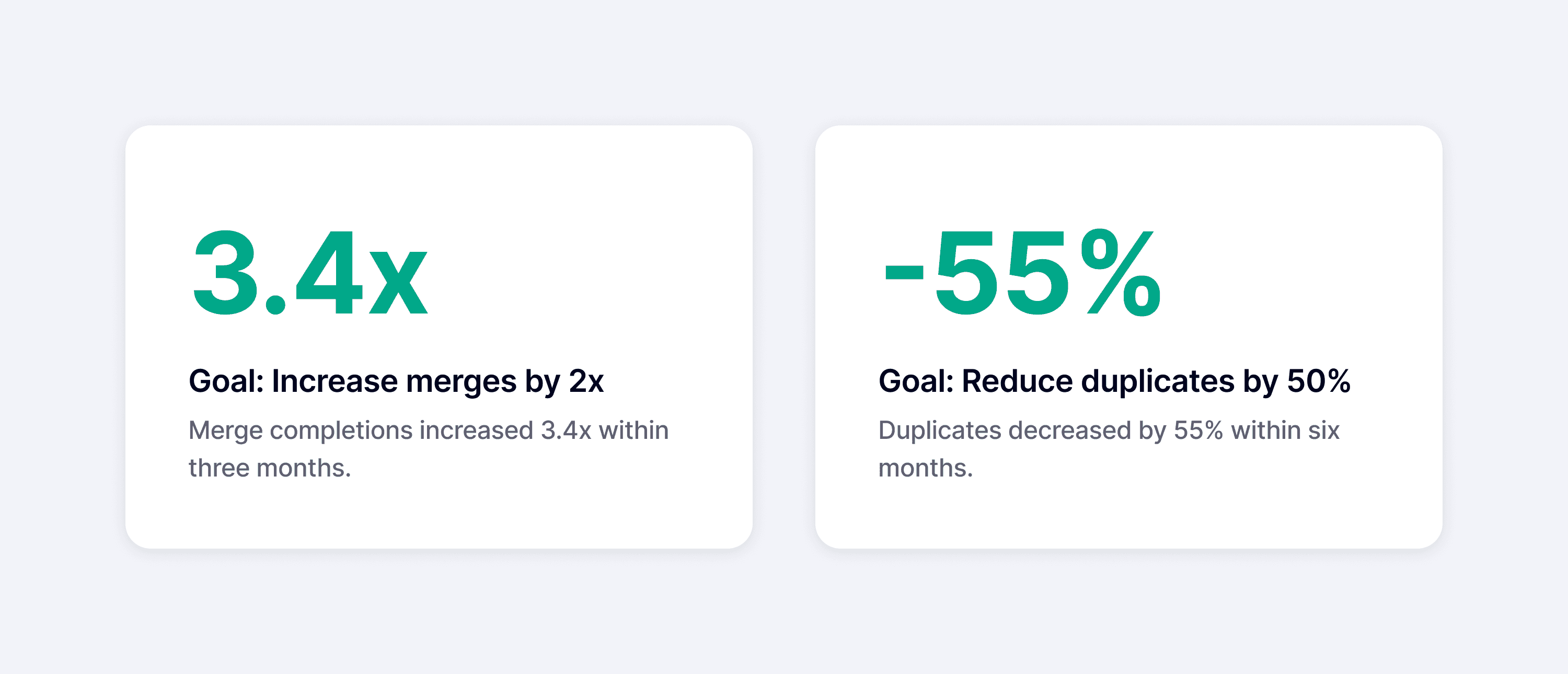
Within three months, merge completions increased 3.4x, driven by a 530% increase in company merges and a 200% increase in people merges, exceeding our adoption goals.
Within six months, duplicates also decreased by 55%, which demonstrated significant improvements in data quality.

After launch, we received a lot of positive feedback from users, including ones from our Big 10 Customers, whom we consistently prioritized due to their significant impact on our revenue.

Takeaways
Accommodating different modes of working
At the start of the project, I viewed trust as a progressive journey and designed for users to build confidence over time, with the expectation they would eventually adopt more efficient workflows.
However, early interviews indicated that not all users follow that exact path. A smaller segment of users had no desire to inspect data and instead preferred to bulk merge immediately. While this didn't change the core features much, it shifted how I prioritized them. For example, I focused more heavily on the ability to unmerge, which allowed users to act quickly while maintaining confidence they could recover from mistakes.
The key takeaway was that one "ideal" workflow rarely works for all users. Different user segments operate with distinct tendencies, making it important to understand these differences and design for flexibility when needed.