Duplicate Management
Senior Product Designer
2025

PROBLEM
Duplicate records eroded trust in the platform
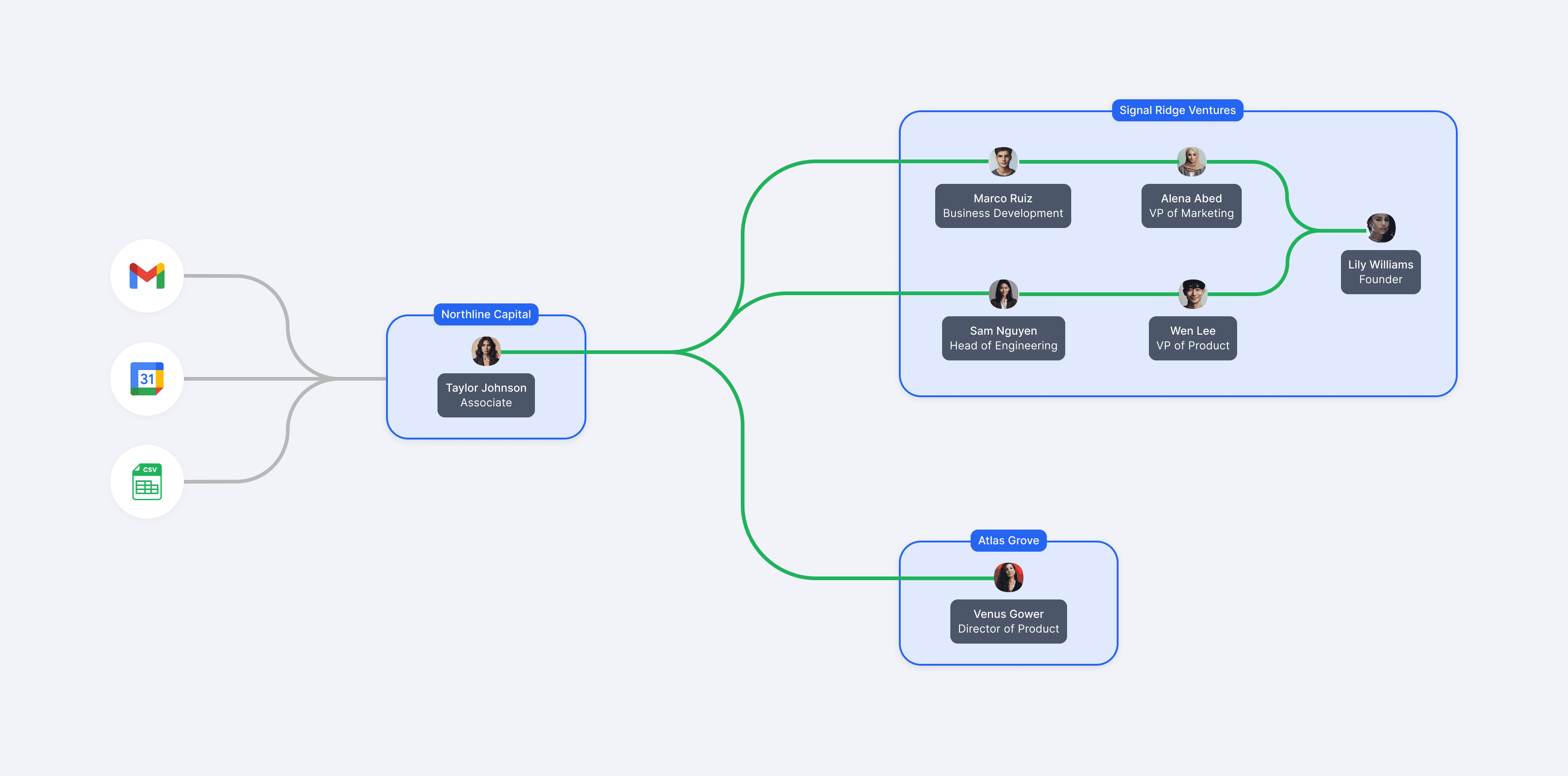
Affinity is a CRM that helps investors uncover opportunities within their relationship network. Since its insights are only as reliable as its underlying data, data quality is fundamental to the platform's value proposition. However, since data is automatically imported from sources like email, calendars, and CSVs, duplicate records often emerge, which can erode trust in the insights customers rely on.
At the time, Affinity was focused on a company-wide initiative called Nail the Basics, prioritizing core product quality over new features. Reducing duplicate records became a key initiative after customers consistently identified data quality as one of their biggest pain points.
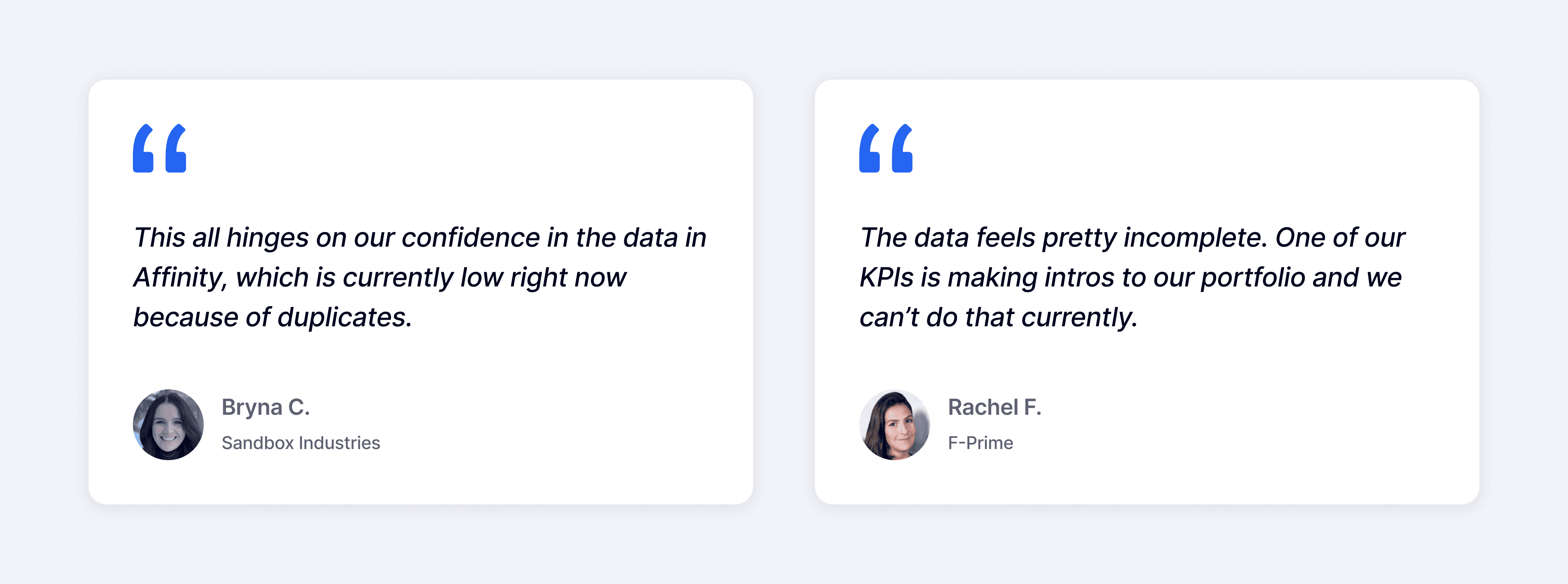
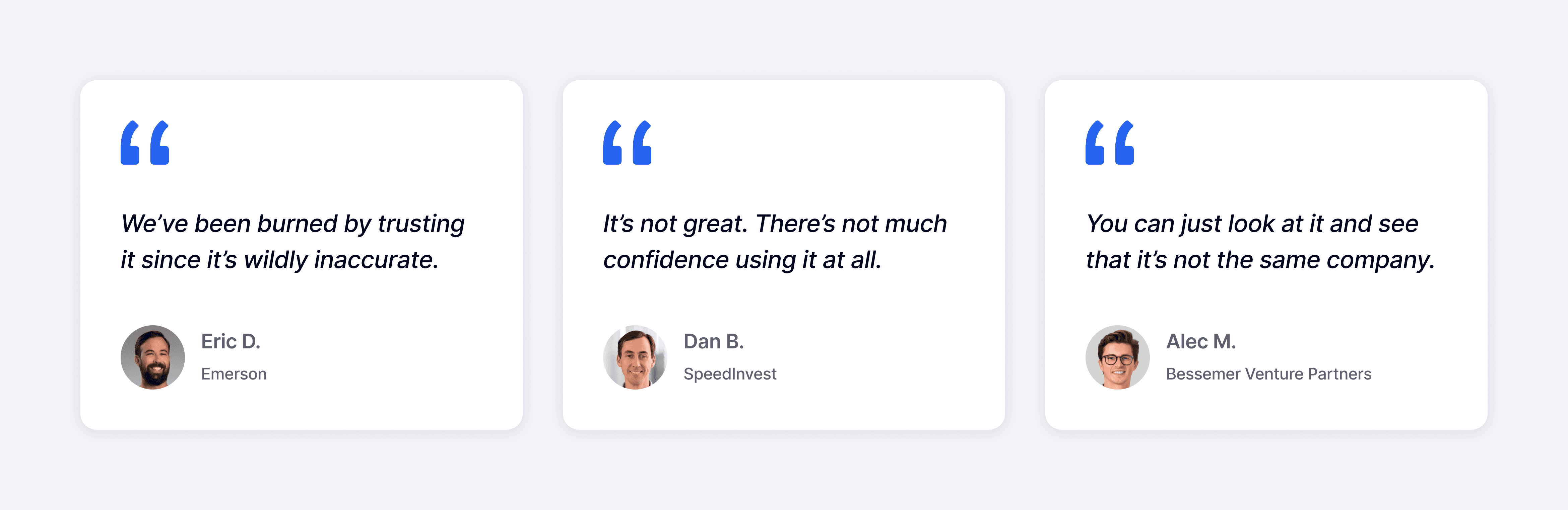
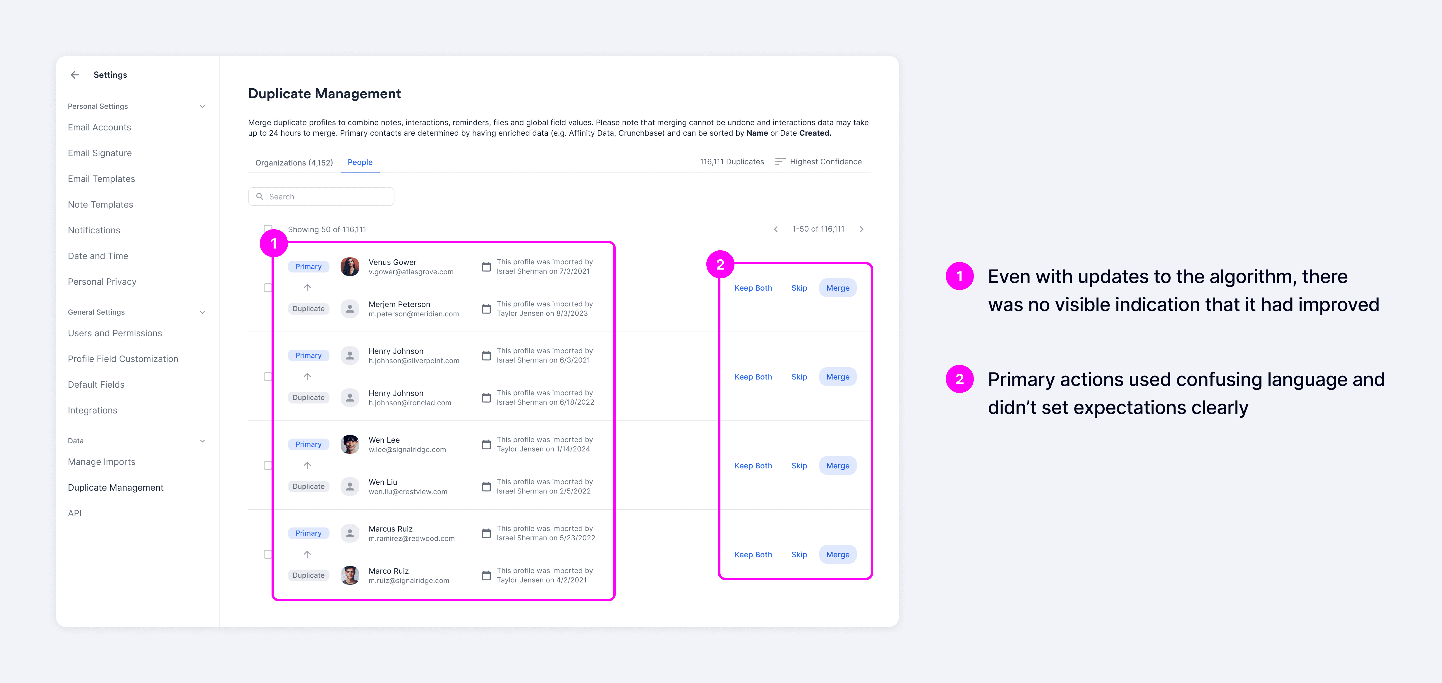
Although Affinity already offered a Duplicate Manager at the time, users rated it just 1.6 out of 5 for usefulness, and more than 100+ customers had requested improvements. The biggest issue wasn't just match accuracy—but it was also trust. The system often surfaced false positives, and even as the matching algorithm improved, users had no visibility into why records were recommended, which left them skeptical of the results.
Instead, most customers just manually navigated between different pages to merge duplicates, making an already repetitive task even more time-consuming.
Explorations
Balancing immediate needs with long-term scalability
I explored a range of design concepts focused on giving users control over the underlying data. These included two primary patterns: an accordion layout optimized for speed and efficiency, and a full-page layout designed to support deeper evaluation.
I connected with customers and walked them through each concept to gather feedback. Across the board, the ability to see and control data at the field level was strongly validated and received positively.


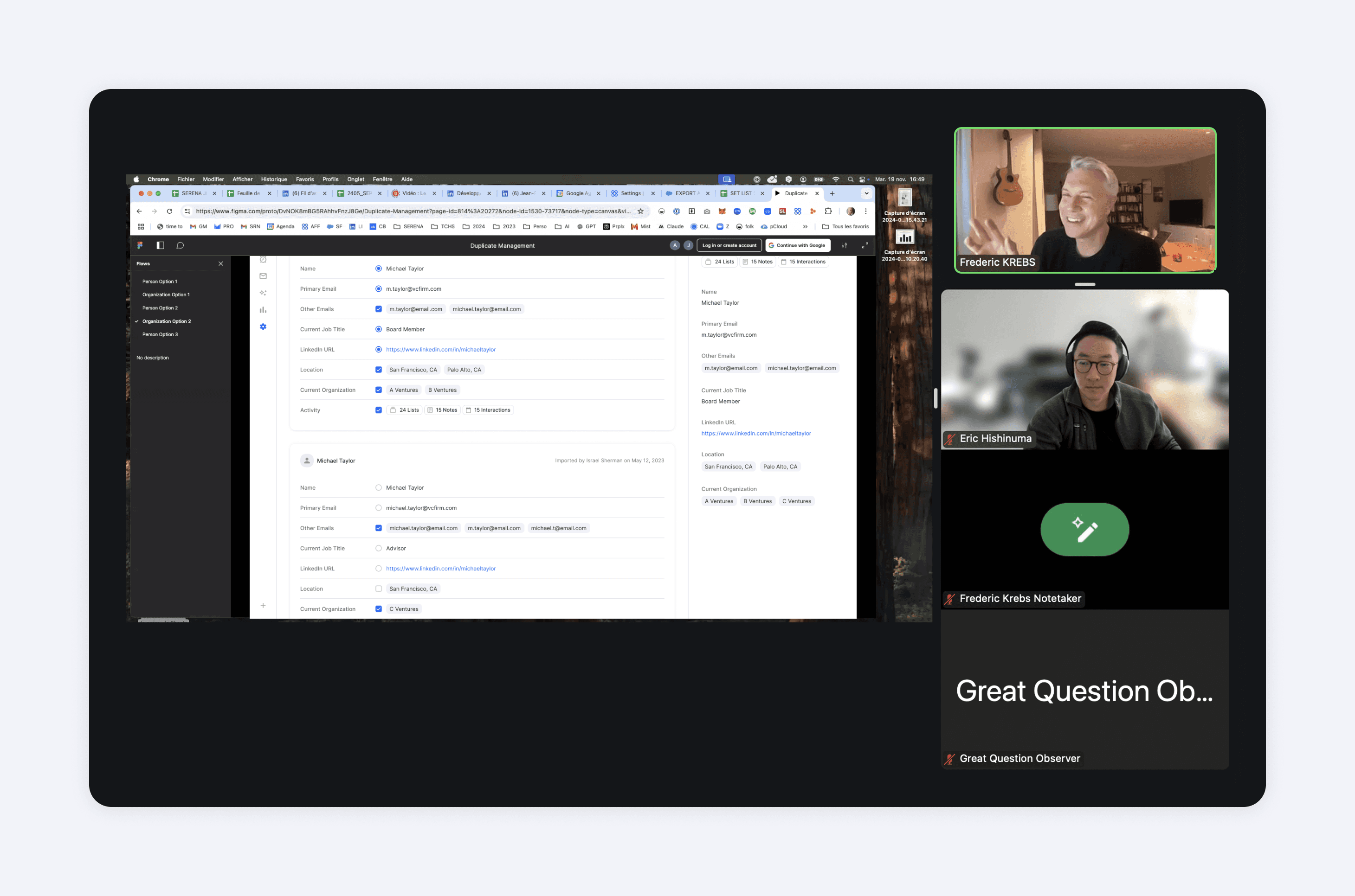
When comparing the two patterns, the accordion layout was perceived as more efficient and allowed users to quickly scan details without needing to navigate elsewhere, while the full-page layout was more thorough and provided a more focused environment.
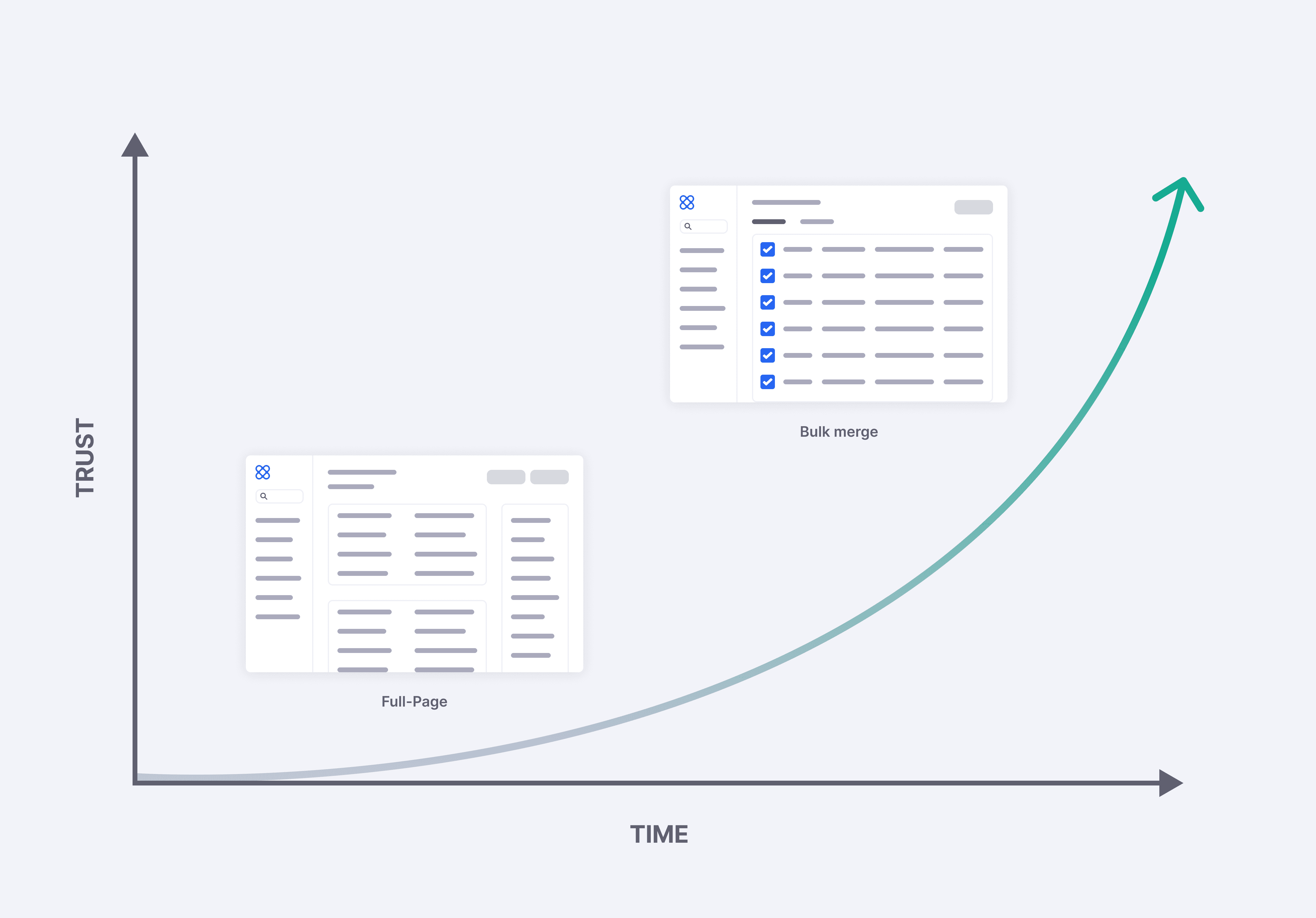
Although the accordion pattern offered greater efficiency, we chose to move forward with the full-page layout since our goal was to enable users to confidently adopt bulk merge as their primary workflow. The full-page layout better provided the depth and clarity needed to build that trust.
Usability Testing
Addressing friction points identified in testing
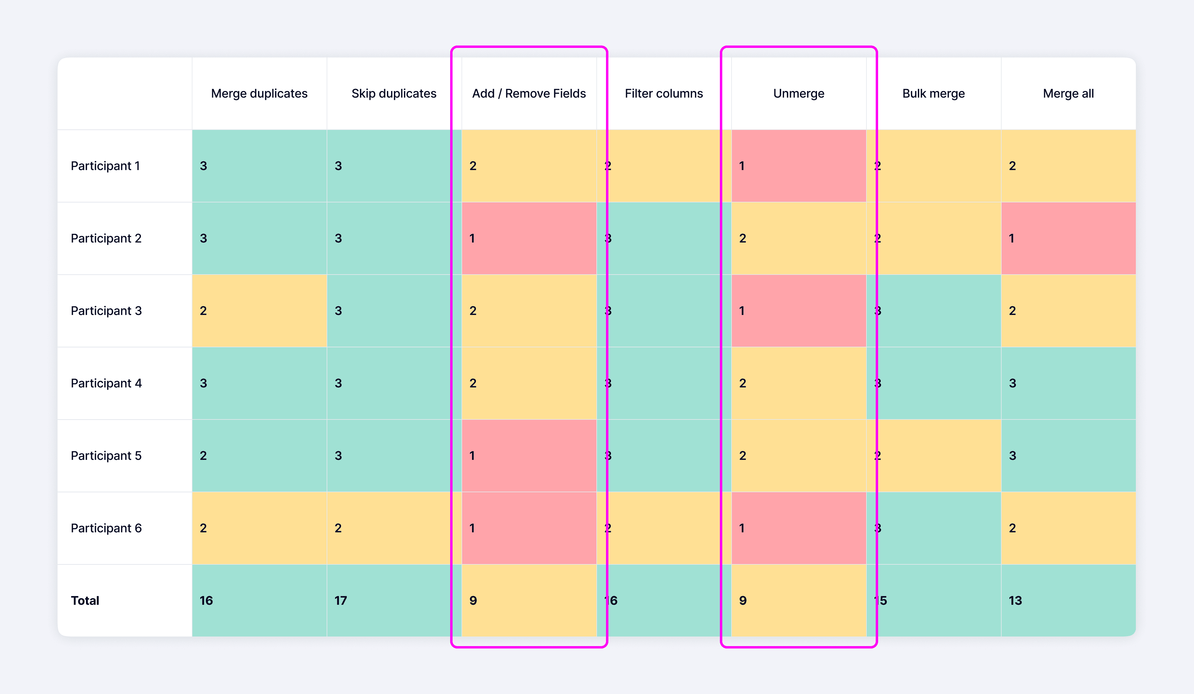
After multiple rounds of iteration, we conducted usability testing to validate the experience. While participants completed the core tasks with little difficulty, the sessions uncovered several usability issues that we addressed before launch.
We later partnered with engineering to evaluate technical feasibility and prioritized improvements that delivered the greatest impact for the least implementation effort.
Final Designs
Reducing uncertainty before merging

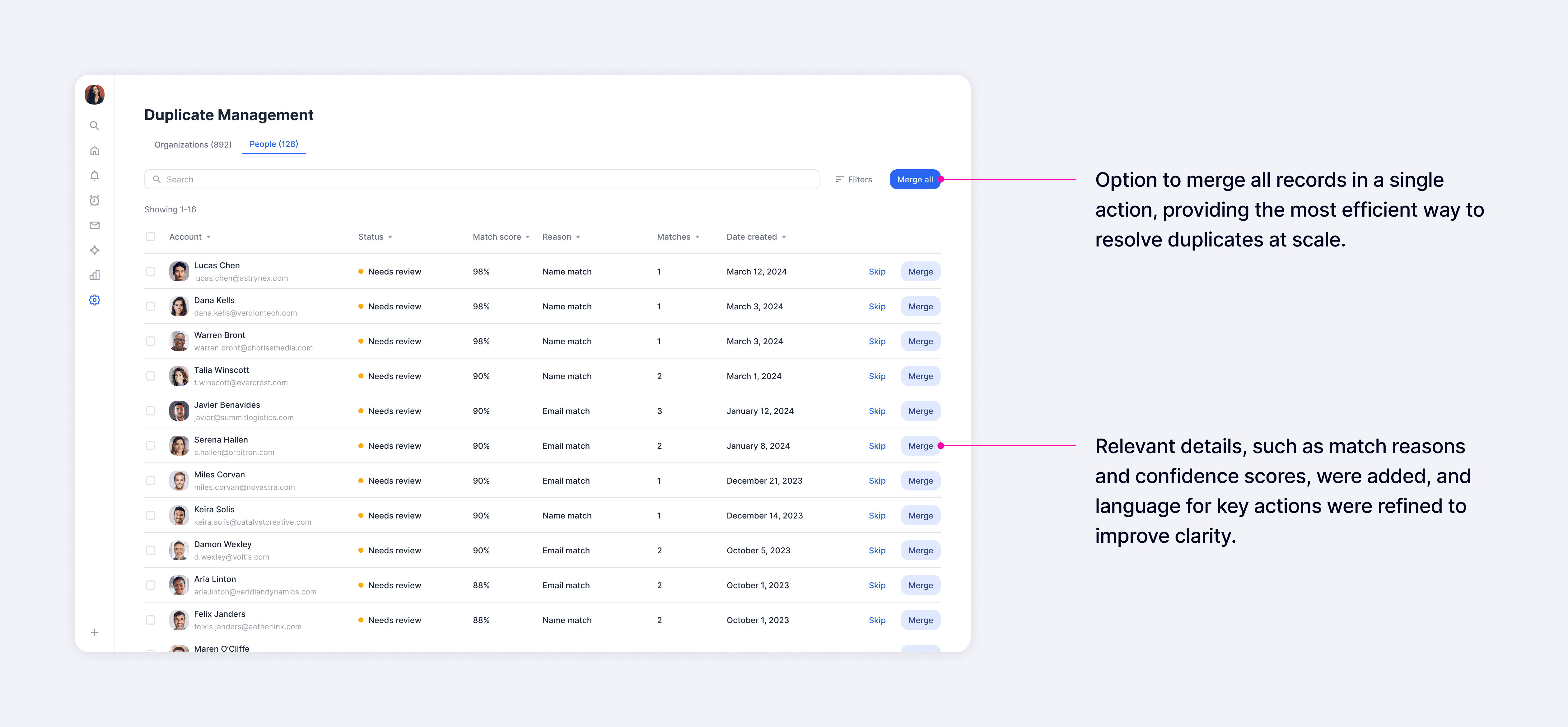
While users expressed a strong need to control the underlying data, they also found significant value in seeing signals like match reasons and confidence scores, which provided far more context than the previous experience. In the main list view, our goal was to surface as many relevant signals as possible so users could quickly assess matches and take action.
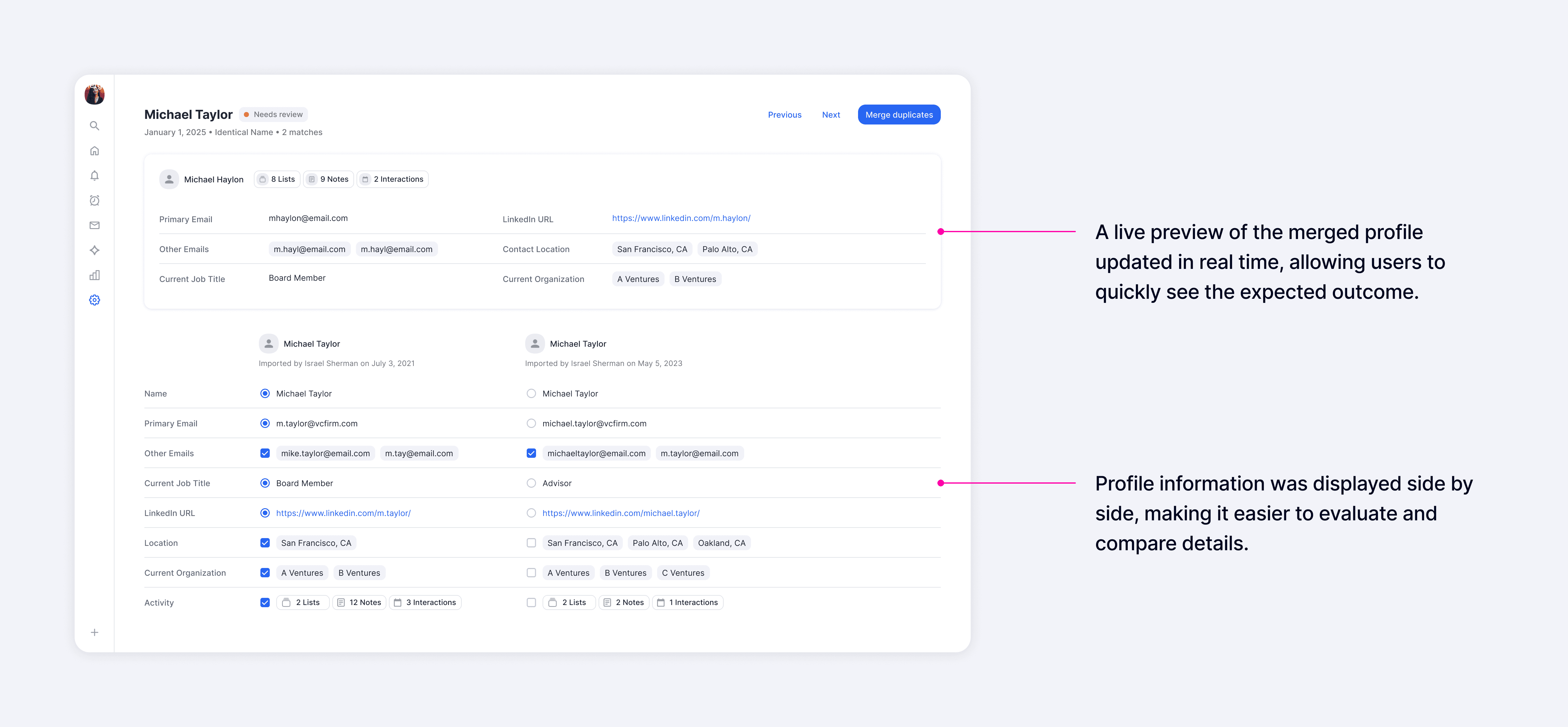
For deeper evaluation, the detail view presented all fields side by side, which made it easy to compare records and choose which values to carry into the merged result. A real-time profile preview showed the final outcome as users made selections, which helped them understand exactly what would happen before committing a merge.
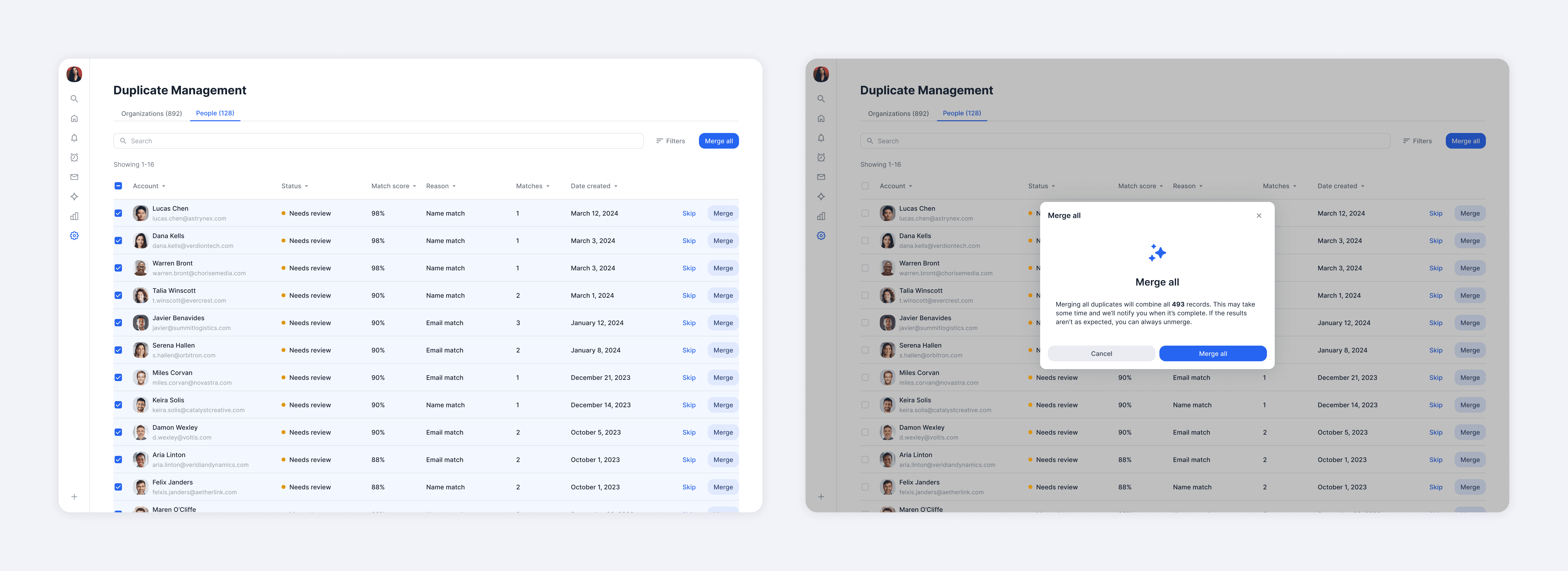
As trust increased, users could shift to bulk merging for greater efficiency. While most preferred to carefully review each merge, a segment of users had no time to inspect and wanted to act immediately. Supporting both behaviors was essential for us to meet different user needs.
Impact
Measuring impact through quantitative and qualitative feedback
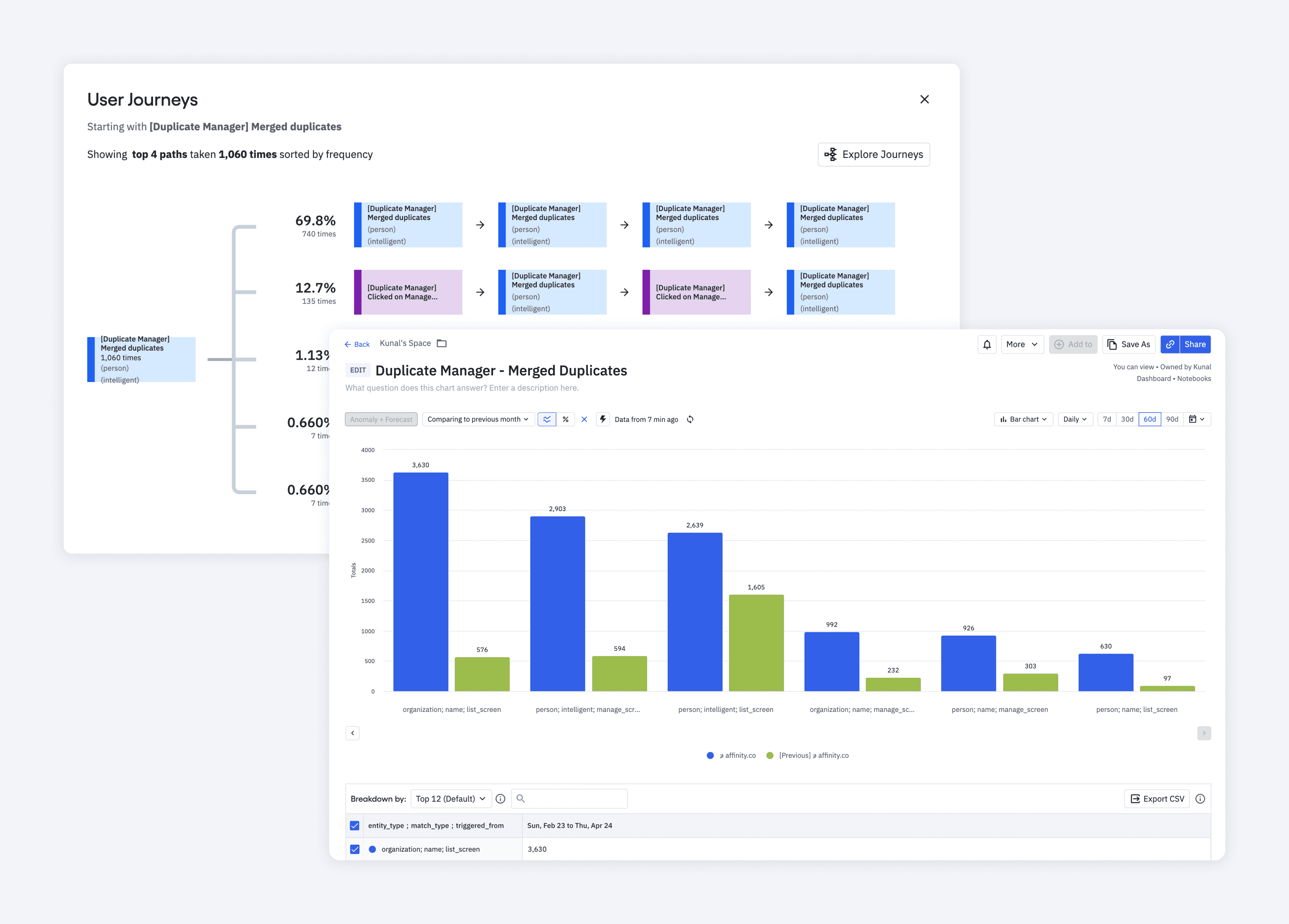
Within three months after launch, we saw a 530% increase in company merges and a 200% increase in people merges, which exceeded our adoption goals. Within six months, duplicates also decreased by 55%, which demonstrated significant improvements in data quality.
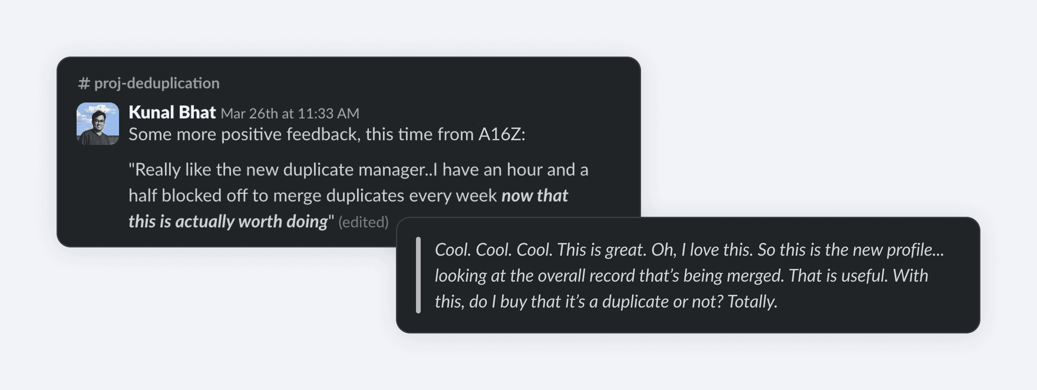
After launch, we also received positive feedback from our Big 10 Customers, whom we consistently prioritized due to their significant impact on our revenue.
Takeaways
Accommodating different modes of working
At the start of the project, I viewed trust as a progressive journey and designed primarily for users to build confidence over time. However, early interviews indicated that not all users follow that exact path. A smaller segment of users had no desire to inspect data and instead preferred to bulk merge immediately. While this didn't change the core features much, it shifted how I prioritized them. For example, I focused more heavily on the ability to unmerge, which allowed users to act quickly while maintaining confidence they could recover from mistakes.
The key takeaway was that one "ideal" workflow rarely works for all users. Different user segments operate with distinct tendencies, which made it important to understand those differences and design for flexibility when needed.