Transaction Decisioning
Senior Product Designer
2022

Context
"Do you offer fraud prevention tools?"
This was a frequently asked question by both current and prospective customers of Marqeta.
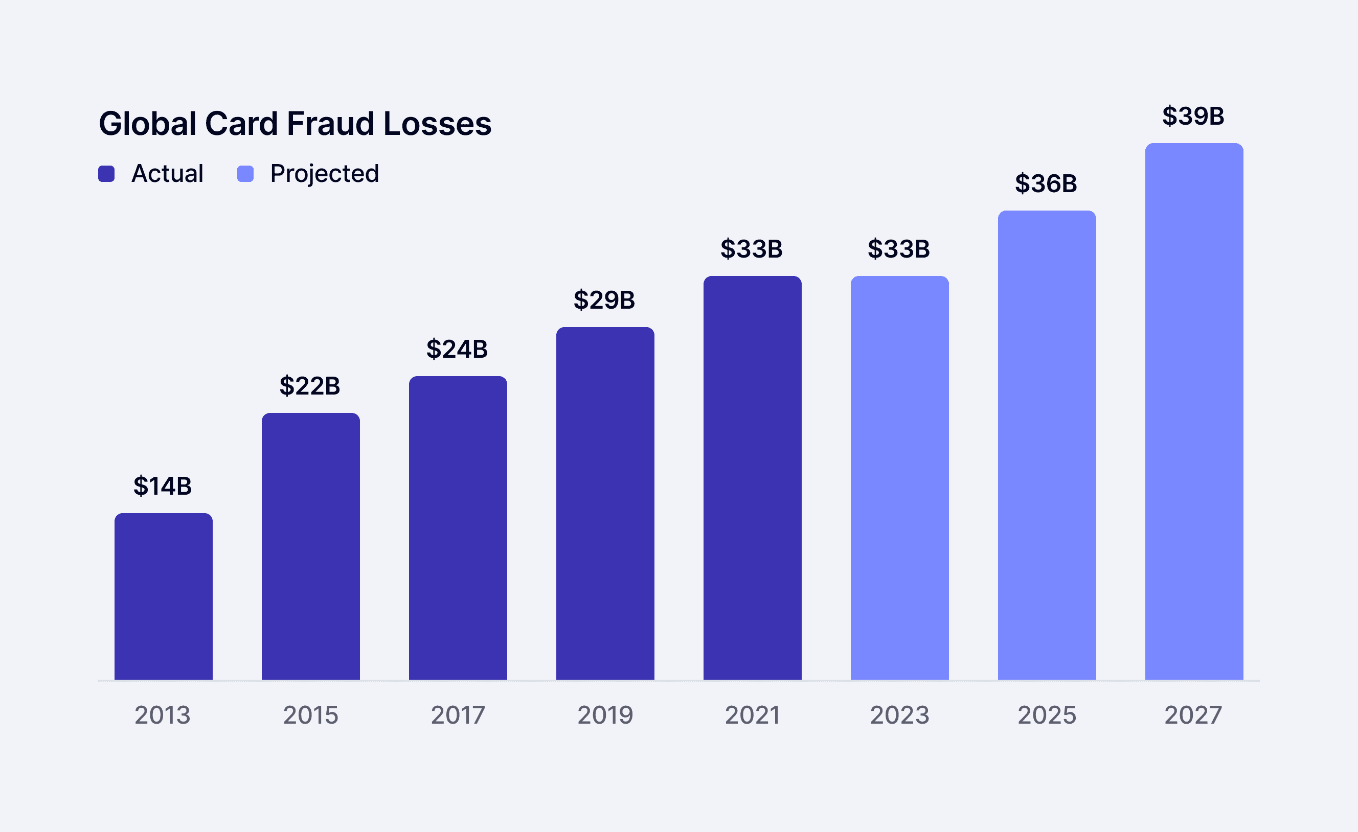
Payment fraud was a real concern for Marqeta's customers as undetected fraud led to large financial losses. At the time of this project, a report found that 82% of companies had been victims of card fraud and worldwide losses were projected to be around $39 billion by 2027.
As a card issuing company, Marqeta offered little to no fraud prevention tools. This gap resulted in lost deals and unfulfilled customers highlighting the need to develop tools quickly.
The following dashboard was developed for risk ops teams to help manage their fraud better. As the lead designer on this project, I worked with a PM and a team of engineers to ensure the successful launch for this tool.
Problem
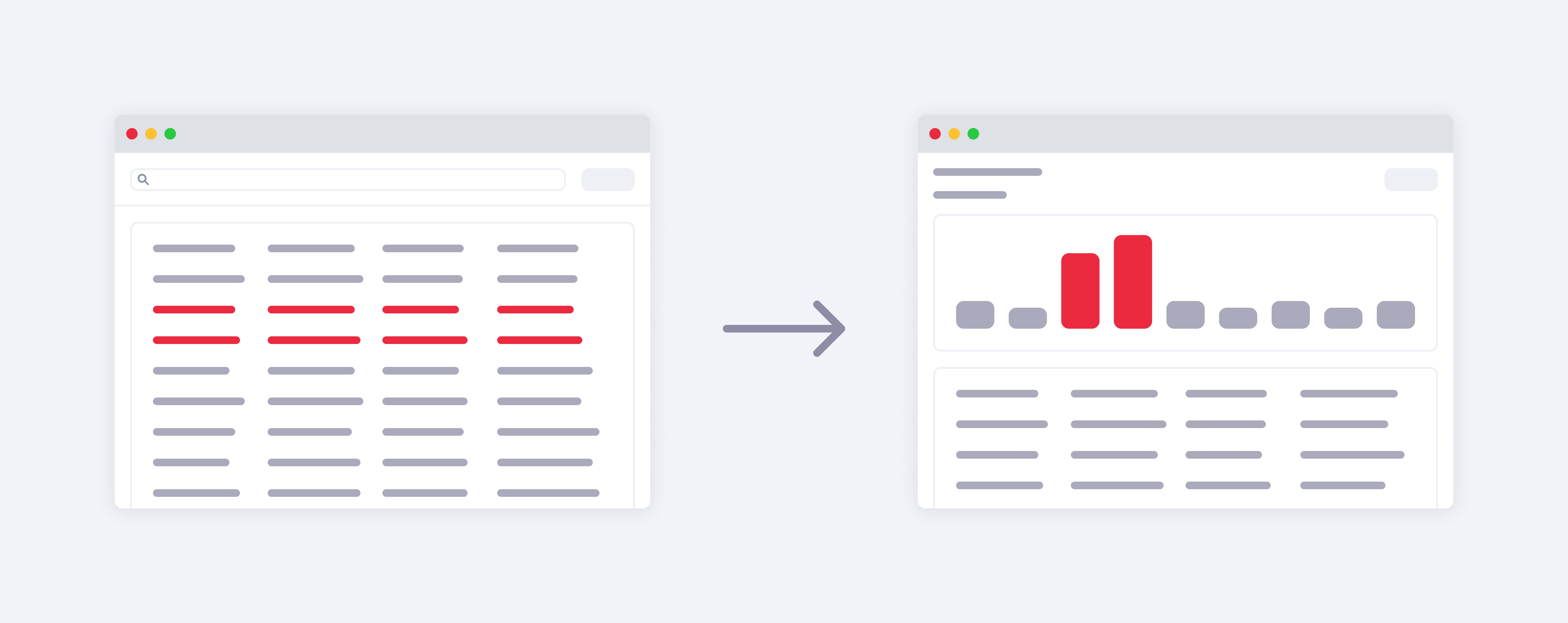
Using spreadsheets was ineffective and time-consuming
At the time, risk analysts of Marqeta's customers were using fraud rules where they could create and run rules that would decline high-risk transactions.
Analysts would manually review their results using spreadsheets and tables, which was very inefficient. This approach made it difficult for them to identify unusual patterns or deviations from the norm requiring further evaluation.

Goals
Offering analysts insights to understand fraud activity
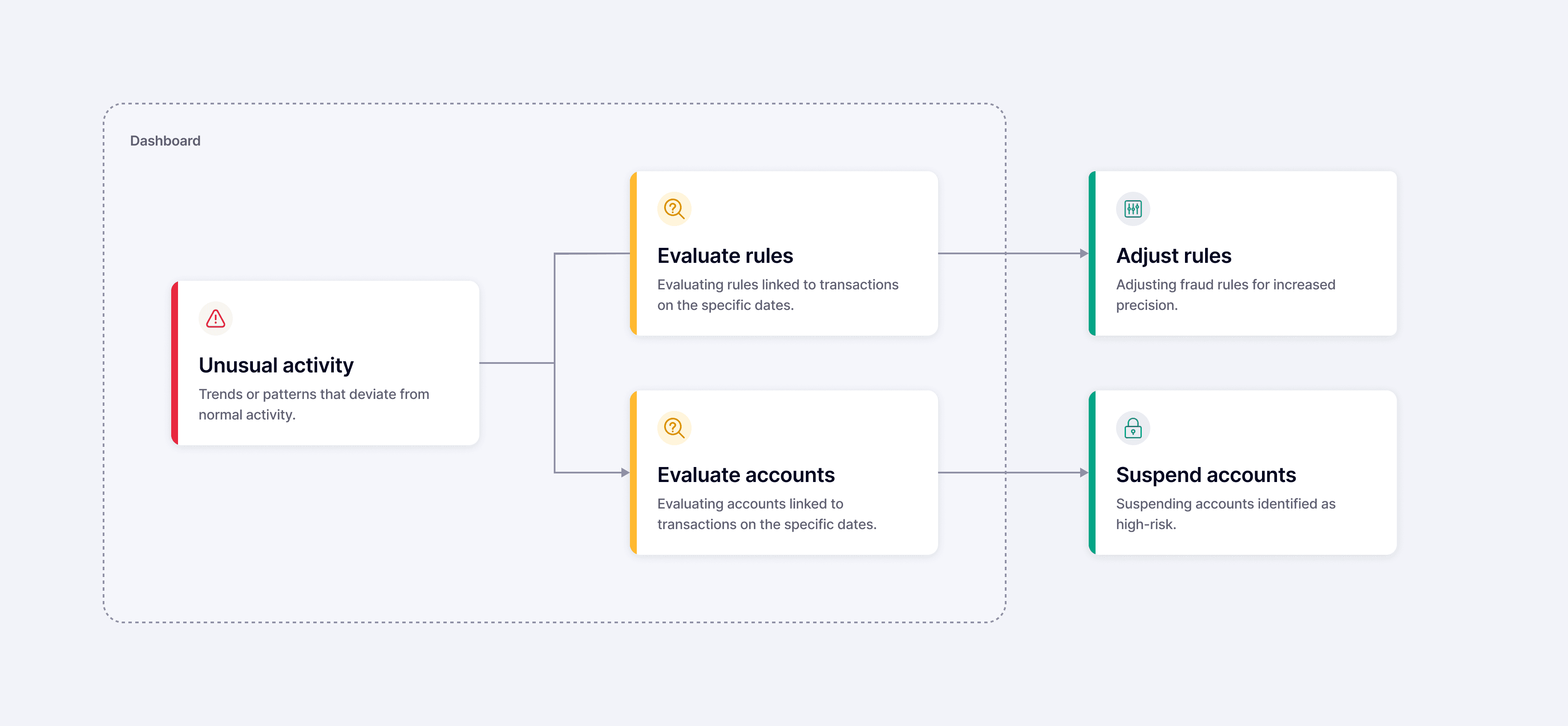
For this project, our goal was to create a dashboard that offered risk analysts insights to facilitate more accurate rule adjustments and easier account investigations.
A few things we wanted to consider:

The dashboard wasn't meant to provide a final resolution, but rather serve as an initial step in uncovering actionable insights in the fraud investigation process—further actions would take place outside of the dashboard. We established this clear distinction to maintain a lean scope for the project.
Explorations
Weighing out different options
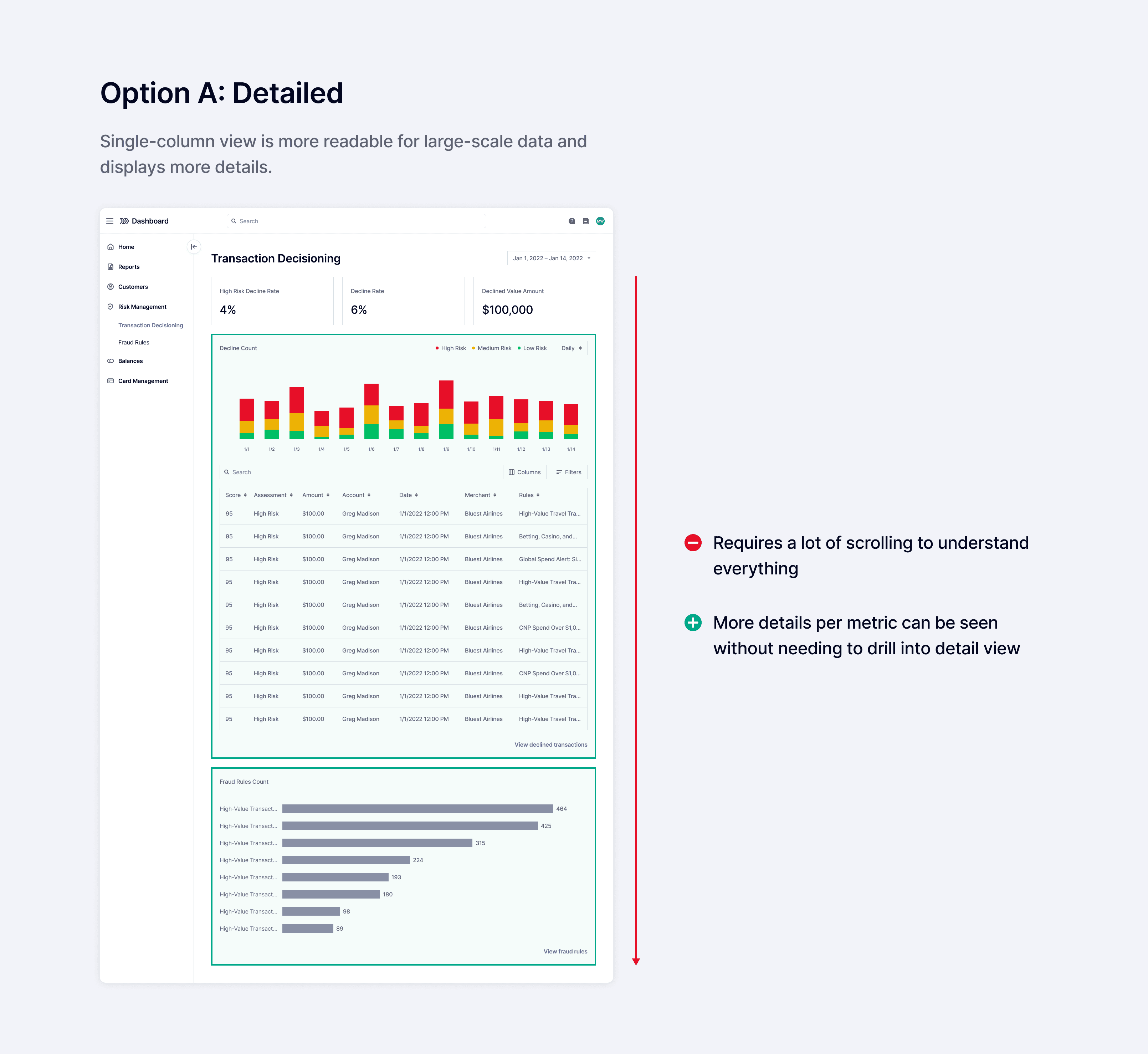
As we began to construct the page layout, I considered trade-offs for different options I was exploring. I reviewed these different directions with stakeholders to help inform my decisions as I iterated
Risk analysts felt they could make more well-informed decisions when they could see the full picture. My goal with these explorations was to provide as much detail as possible, while maintaining balance and minimizing scrolling.


Feedback
Gaining key insights through testing
Over a two-week period, we ran moderated testing sessions with 10 participants to evaluate pros and cons for the two options we were considering.
Our objectives for these sessions was to gain clarity on the following questions:
Can users understand insights and feel confident in taking action?
Are there any essential features missing that prevent users from completing their tasks?
Which option is more preferred and why?

Through our findings, we identified key themes in both options that we looked to address. These ranged from broader issues about the overall information hierarchy to more specific feedback on how data was being displayed.

Key Insight
There was no need to show transaction details upfront
We chose to move forward with Option A since participants validated our initial assumptions that it was easier to read and could handle data at scale. However, one of the main issues we heard often was how long the page length was.
7 out of 10 participants mentioned that it required a lot of scrolling to understand everything—it was especially difficult when cross-referencing data.
Much of this space was occupied by the transaction table. In these sessions, we learned that transaction data wasn’t as important to see upfront and was more useful as a next step if any unusual activity was identified.
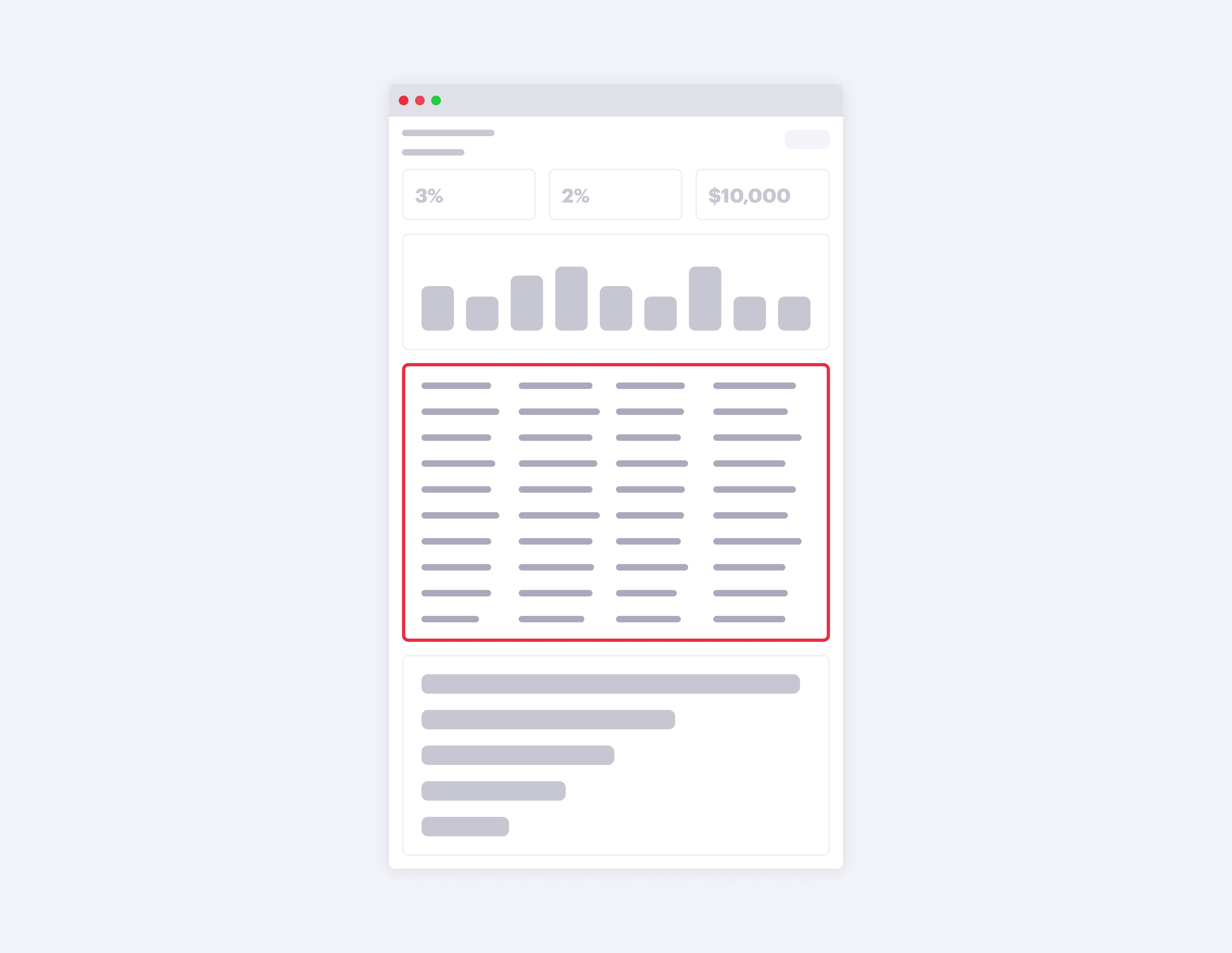
As a result, we removed the table to shorten the page length. Users could drill down deeper to access details if necessary.

Final Designs
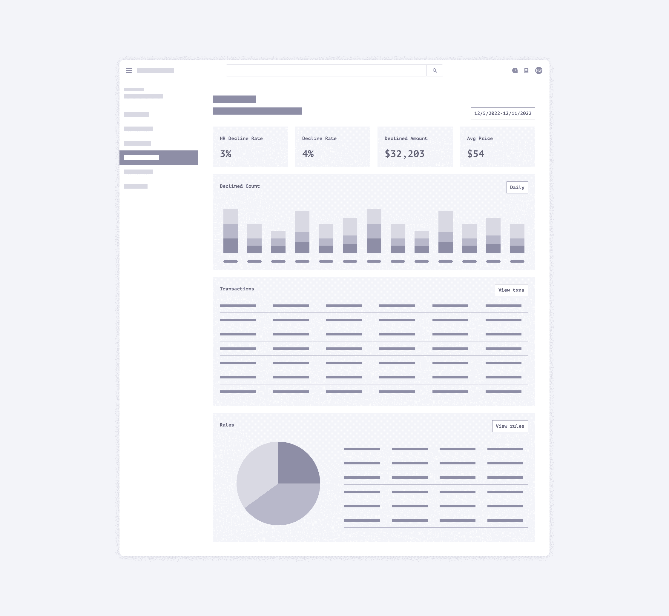
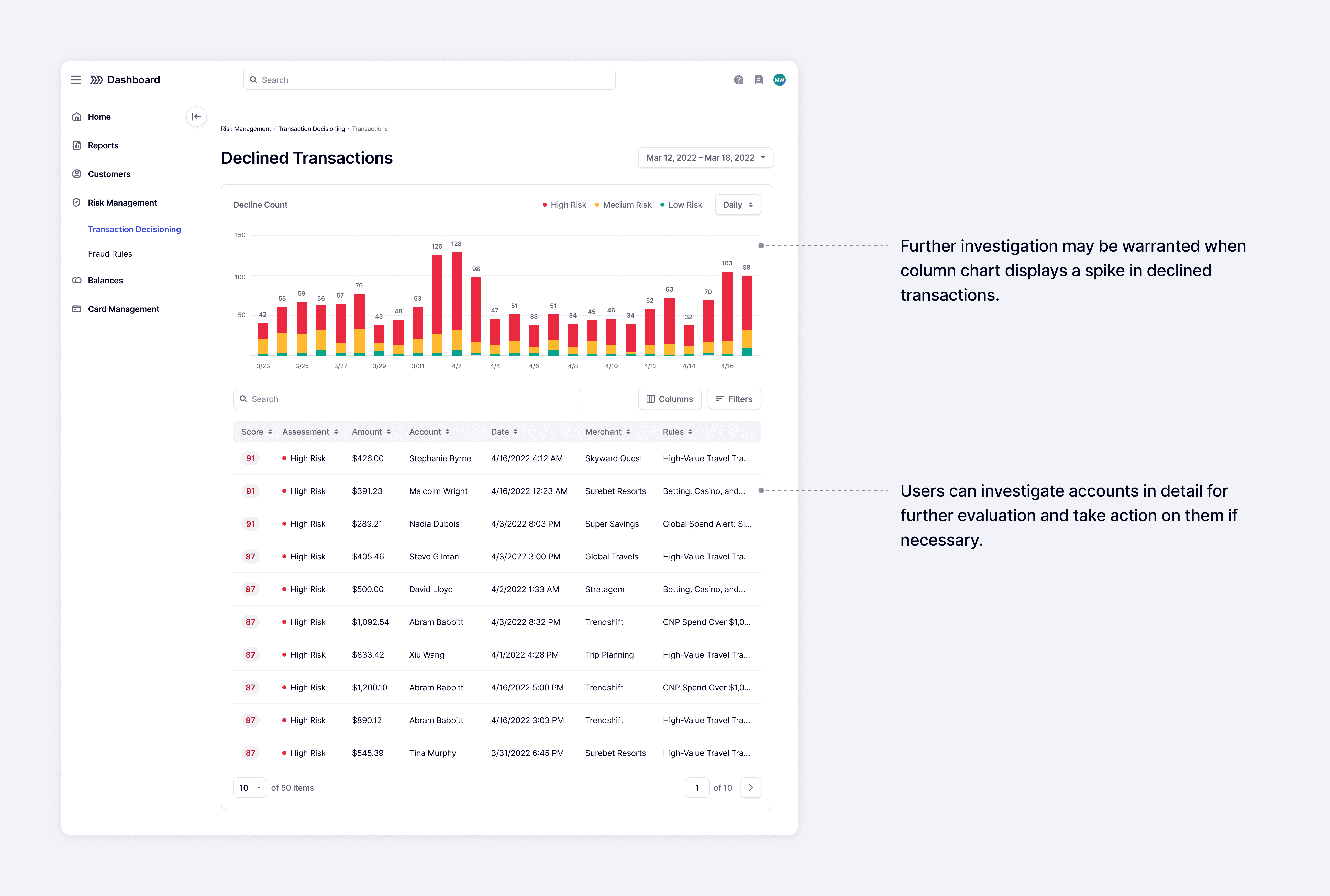
Improving efficiency by understanding data at a glance
One of our main focuses was to optimize the dashboard for efficiency. It was important to make the dashboard easily understood at a glance while minimizing scrolling. Distilling metrics down to the essentials was an important aspect in accomplishing this.
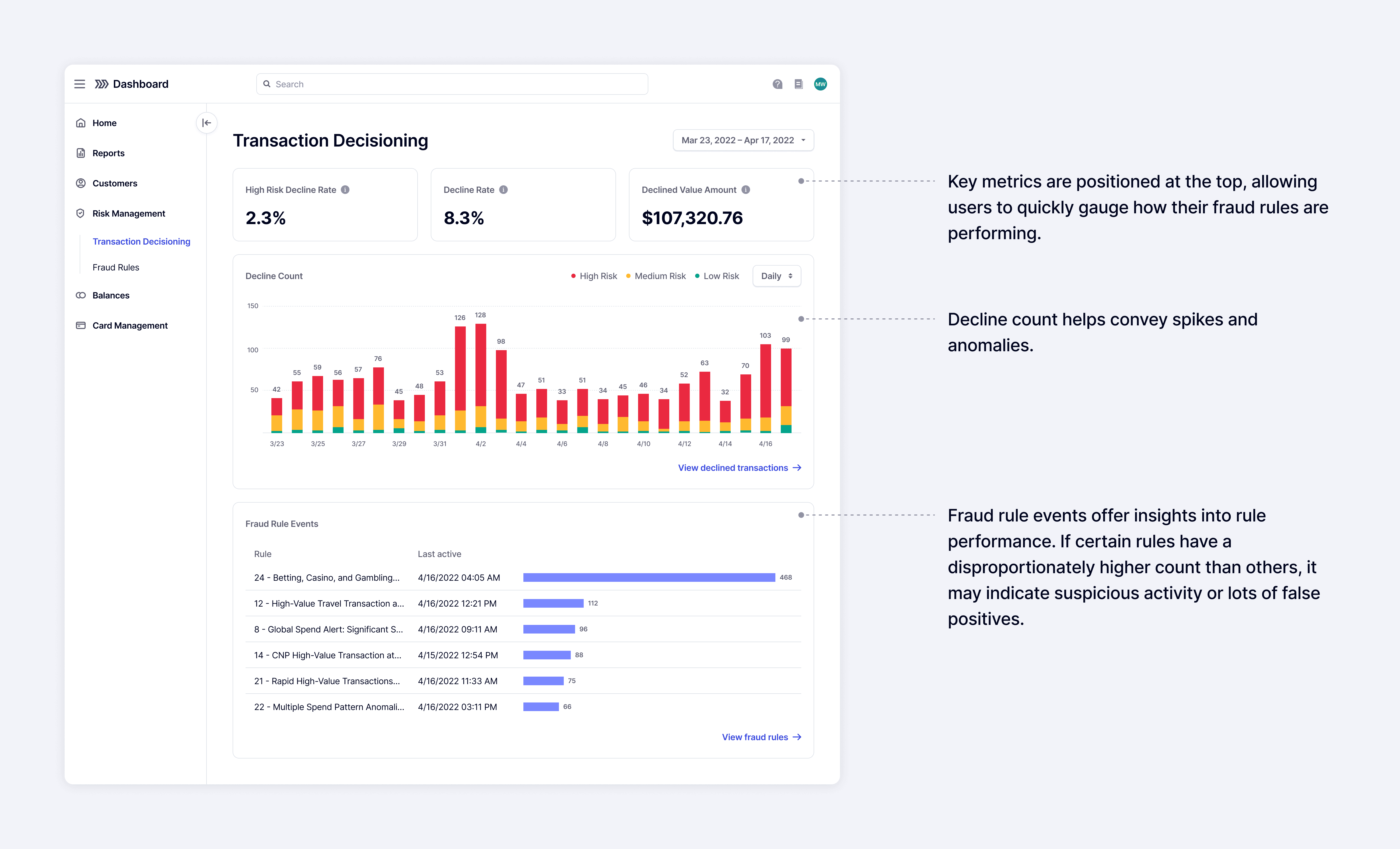
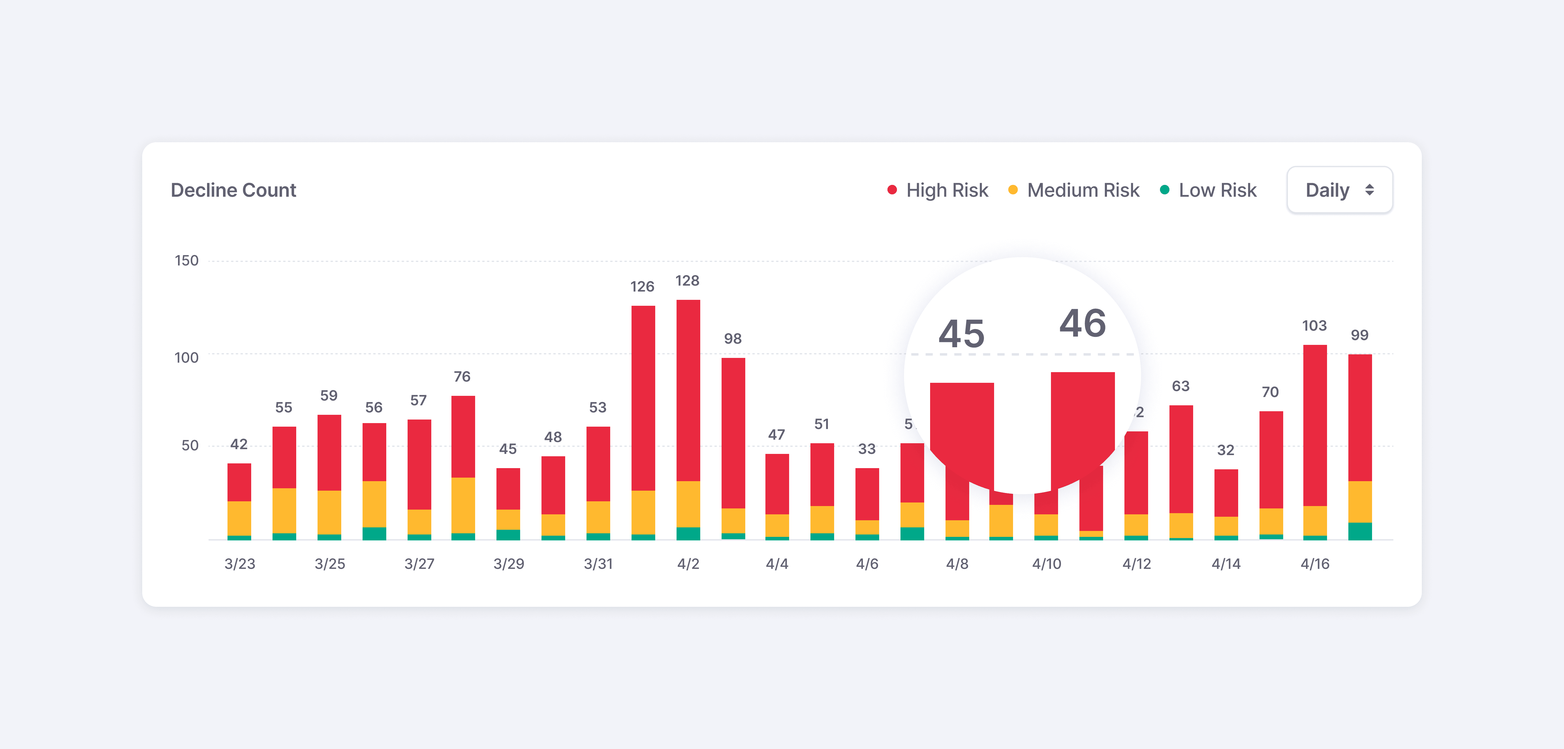
Surfacing insights through data visualizations and clear labels
Using visualizations to display data helped analysts easily recognize patterns and anomalies, which they couldn't do very well with their previous method. Our goal was to keep the visualizations simple and straightforward for increased clarity.
Numbered labels were added to each column to facilitate easier comparison between data points.
Providing easier access to accounts and rules
By integrating the dashboard into the Marqeta App, we provided analysts with more accessible entry points to fraud rules and account details. This provided an easier way to adjust rules and investigate accounts.

Impact
Delivering value quickly to customers
The Transaction Decisioning dashboard was launched in April 2022 as part of the RiskControl product suite. It was a valuable tool for customers and enabled them to monitor and manage their fraud much more efficiently than their previous method.
This dashboard demonstrated our team's commitment in listening to customers and focusing on their needs to deliver timely solutions. By adopting a user-centric approach, we were able to make sure that the UX and features aligned with our customers' expectations.

Takeaways
Leveraging resources where you can for feedback
A challenge I faced in this project was coordinating customer calls for design feedback. Due to busy schedules, it was often difficult to find suitable times for discussions. Additionally, many design reviews only required brief feedback and didn’t justify scheduling long formal sessions.
To address this, I frequently consulted with internal risk analysts at Marqeta for feedback through quick Slack huddles and messages. Building a close rapport with them made it easy to reach out regularly and resulted in more candid feedback.
Through this experience, I’ve come to appreciate the importance in building strong relationships across teams and taking in feedback from all different types of users.